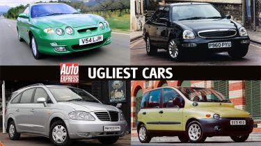
Top 10 ugliest cars ever made
A sight to behold for all the wrong reasons: these are the ugliest cars ever made
Beauty, they say, is in the eye of the beholder. However, over the years, some cars have proven so visually challenging that few would argue they’re anything other than ugly. Whether the designer was trying hard to stand out or clung on to a styling concept that just didn’t work away from a sheet of paper, the result is usually the same - looks only a manufacturer could love.
But are any of these cars truly ‘ugly’? A quick whip around the Auto Express office to canvas staff member’s opinions on design stinkers tended to favour older models more than new, including some ‘classics’ of this unsightly genre. Maybe ugly cars take a while to bed-in to the public consciousness and be truly appreciated or maybe some design themes just don’t age as well as others.
Take a look through our ugly car choices and decide for yourself how they compare to the modern slew of angular, in-your-face motors. Perhaps, in comparison, the newer stuff isn’t so bad…
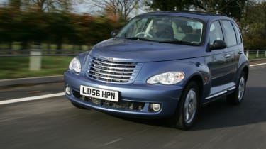
Chrysler PT Cruiser
In contrast to a lot of the cars here, the Chrysler PT Cruiser wasn’t roundly mocked upon release. In fact, reception was very favourable, with several - including US outlet Motor Trend - naming it their car of the year. Chrysler sold plenty of them in the US, and a reasonable number in the UK, considering how uncompetitive a package it was over here.
A big problem for the Cruiser, however, was its failure to snare the younger, cooler buyers Chrysler was after. We can see why - the PT Cruiser took elements of the striking Chrysler Pronto Cruizer concept and grafted them onto a lofty, blob-like bodyshell. The tall grille and bulbous wheel arches recall customs of the fifties, but only very vaguely. Worse still is the convertible version, which looks ungainly roof up or down. And the less said about the driving experience, the better.
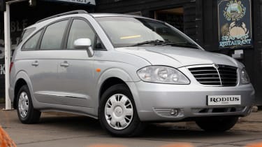
Ssangyong Rodius
Ssangyong has launched its fair share of questionably-styled products over the years, but one rises above all others to take the dubious honour of being not just the Korean firm’s ugliest-ever car, but perhaps the most hideous motor in history. We’re talking, of course, about the first-generation Rodius.
Interestingly, its designer Ken Greenley used to be head of the Royal College of Art's Transportation Design School, an institution which counts Ian Callum and other car design greats amongst its former pupils. The story goes that Greenley took inspiration from luxury yachts when penning the Rodius, but unfortunately, that concept didn’t work so well for a large, reasonably-priced and cheaply-made MPV.
The Rodius is a mess of lines and features a front grille that looks like a bad knock-off of the one belonging to the (also very ugly) third-generation Lancia Delta. It’s even worse at the back end, where a fat, sloping C-pillar is topped by an incongruously boxy glasshouse. It’s a ropey car on the whole - Auto Express awarded it a single star in its review.
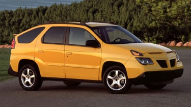
Pontiac Aztek
Many modern SUVs claim to be ‘lifestyle’ vehicles ideal for those who enjoy outdoor pursuits, but all are outdone by the Aztek in this regard. Here is a car with a removable drinks cooler and a Range Rover-like split tailgate complete with boot-mounted audio system controls for anyone sitting on it when it’s folded out. There’s even an optional camping kit including an attachable tent.
Unfortunately, all anyone could focus on with the Aztek was the way it looked. It was deliberately styled to be bold and aggressive, but the gawky results were almost universally derided. The Aztek is such an enduring laughing stock that it was ‘cast’ as the daily driver of one Walter White in the acclaimed TV show Breaking Bad, providing a metaphor for a man’s life that hadn’t quite worked out as hoped.
The appearance has helped the Aztek become something of a cult car, but without changing anyone’s options of its unfortunate aesthetics.
Subaru Tribeca
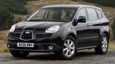
In the latter half of the noughties, Subaru referenced the aviation history of brand owners Fuji Heavy Industries with a three-part grille. The theme appeared on a couple of Kei cars and the ‘Hawkeye’ Subaru Impreza, but it looked its worst on the Tribeca SUV. The word ‘gopping’ seems too kind.
Plans to build a far-better-looking version branded as the Saab 9-6X were scrapped when then-Saab owner General Motors sold its stake in Fuji Heavy Industries, but the styling wrongs of the Tribeca were eventually righted - In 2007 a heavily facelifted version was revealed with a far more conventional grille arrangement. Subaru wisely dropped the motif from other cars too.
Ford Scorpio MkII
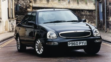
Underneath, the second-generation Scorpio doesn’t deviate all that much from its predecessor. You wouldn’t know it from the outside. Ford sought to differentiate the new Scorpio from the Sierra aesthetically, and for better or worse, the Blue Oval certainly succeeded.
The motoring press was quick to give the Scorpio MkII’s styling a good kicking, particularly its face, which looked like it had already had several and was frequently likened to that of a frog. Its plump, rounded rear didn’t win itself many fans either. Ford’s mid-life refresh improved the situation slightly, but the Scorpio remained a shoddy attempt at bringing a slice of retro Americana to Europe.
Those unfortunate looks do, however, mean this is a rear-wheel drive fast Ford you can buy - potentially with a Cosworth-tuned V6 - for very little in the 2020s. Every cloud.
Fiat Multipla
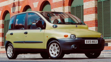
We shouldn’t be too hard on the original Multipla. For starters, it was innovative, being significantly shorter than its rivals yet able to carry six thanks to three-abreast seating in the front. And it’s commendable that Fiat managed to come up with something that genuinely stood out amidst the generic MPV masses back then - it’s just that the Multipla went about it the wrong way. From the globular chunk of metal at the base of the windscreen to the huge windows which gave excellent visibility but an awkwardly tall glasshouse, there’s a lot going on.
As Auto Express once noted when the mid-life facelift came along: “Success will rarely come to a family car that not only scares children, but makes their parents wince too”. Fiat was forced to tone things down to boost sales, which it did partly via a new bonnet which actually met the bottom of the windscreen ‘properly’. Yes, the result was a less distinctive-looking car, but also one less likely to make your stomach turn.
Dodge Nitro
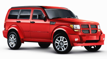
Dodge made a bold move by bringing the Nitro to the UK, but this didn’t really pay off - the SUV wasn’t exactly a sales hit. The Nitro’s chrome festooned, slab-like front end and cartoonishly flared front wheel arches look ridiculous enough in its home country, let alone trundling through the centre of the average home county town.
The styling is far from the Nitro’s only issue. A close relative of the Jeep Liberty, the Nitro doesn’t ride very well, has a poorly-made and cheap-feeling interior, and was offered with a whopping 3.7-litre V6 which somehow splutters out just 203bhp. The four-cylinder petrol isn’t brilliant, either. Most buyers here sensibly went for the slightly better 2.8-litre diesel engine, although buying any Nitro is a decision that’s difficult to understand whatever’s under the bonnet.
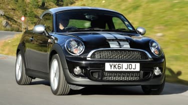
MINI Coupe
The MINI range has been characterised by aggressive expansion, which arguably went a little too far with the Coupe. Up to the bottom of the glasshouse, it’s all as-per the second-generation MINI Hatchback, but from there, it’s all change, and not all for the best.
The MINI Coupe got shorter windows, a much more steeply-raked windscreen and - most unusually of all - a roof which resembles a backwards-worn baseball cap. This gives a bottom-heavy design which - combined with a downgrade in practicality thanks to its two-seat arrangement - failed to win over many buyers.
In 2015, just four years after its market debut, the BMW-owned brand dropped the MINI Coupe and the related (and baseball cap-less) Roadster amidst slow sales and elected to replace neither for the following generation.
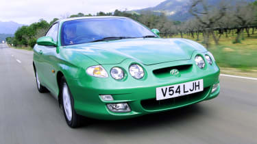
Hyundai Coupe (Mk1 facelift)
While some facelifts do a great job of fixing design issues, some do the opposite. In 1999, Hyundai refreshed its Coupe (called the Tiburon in some markets) and ruined it. Granted, the original one wasn’t a remarkable-looking two-door, but it was reasonably attractive in its own way. But the updated model? Oh dear.
Gone was the original car’s understated fascia, replaced with a drastically different front end with an ugly quad-headlamp arrangement made worse by a pair of bonnet humps leading up from the inner pair. It was discontinued in 2001, making way for an all-new and far easier-on-the-eye Coupe.
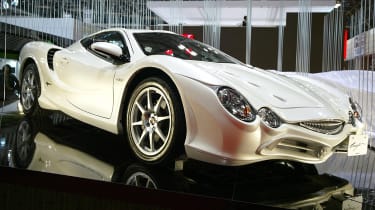
Mitsuoka Orochi
No one buys a Mitsuoka to blend in, but even so, the Orochi goes overboard in its quest to look distinctive. Abandoning the niche Japanese firm’s usual schtick of making coachbuilt oddities inspired by old British sports cars, the Orochi features a bespoke platform (albeit powered by a V6 borrowed from Toyota) and looks unlike no other car on the planet.
The Orochi or ‘huge serpent’ features an overabundance of lines, the face of a confused fish and a general sense of weirdness. With 231bhp feeding a five-speed automatic normally found in an SUV, the Orochi takes seven seconds to go from 0-60mph. This does, unfortunately, mean that you’re unlikely to drive away fast enough to prevent people from spotting you behind the wheel.
Now read our list of the worst cars ever made...

