Why are car sketches so different to the production models?
We look into why car manufacturers put so much effort into producing concept sketches
Early sketches of forthcoming production cars stand out with their futuristic details, aggressive styling and sloping rooflines. So you could be forgiven for wondering why the model doesn’t live up to that tantalising promise by the time the manufacturer has released it into the showroom and it’s parked on your driveway. As your car looks totally different to the drawing, it begs the question: what’s the point?
Safety regulations mean new cars have to adhere to stringent tests, and what you see in that first sketch might not even be attainable. So why do companies go through such trouble to publish these etchings?
Auto Express spoke to designers, brands and safety experts to find out exactly why the final production model doesn’t always match up to those first, alluring sketches... and what the manufacturer gets out of it.
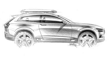
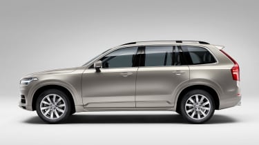
This sketch might look very different to the finished Volvo XC90, with its coupe-like three-door layout and very skinny window aperture, but it had its benefits. This drawing was used to show off the headlight and tail-lamp layout.
What are the sketches for?
The first thing to clear up is the thinking behind releasing these sketches to the public. For the manufacturer, the aim behind this is fairly straightforward: getting its new car out there.
“The main reason for the images is that they allow us to tell the story of a new car launch over an extended period of time, when we don’t yet have access to physical cars,” a Volvo spokesman explained. “Sketches and teaser images help us to highlight key product features, equipment or design themes that will appear on the finished car.”
That sentiment was echoed by a Hyundai spokeswoman, who told us: “To raise awareness ahead of our new model introduction, we use the design sketch as a way to tease public interest. The strongest attributes are highlighted – perhaps exaggerated compared to the real car – to give an impression of how the production model will look.”
While this enables the manufacturer to give potential customers an early look at a car, for a designer, it could be about getting their more extreme ideas seen by bosses.
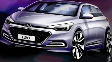
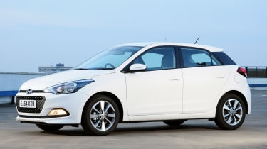
The grille and basic lines are apparent in the sketch for the Hyundai i20. But the low-slung rooflineand wide wheels are taken to the extreme.
“Any designer wants his proposals to be chosen ahead of others and to ‘sell’ his proposal to his boss, and in turn higher management,” said one designer who wished to remain anonymous (we’ll call them designer A). “So everything is done to make that proposal look as good as possible, to give it every chance of being chosen.”
That means things like the wheels are made to look big and tend to be moved out as far as possible in the wheelarches. The suspension is also lowered and the car will be made to look aggressive, with a wide and low stance, too.
However, this exaggerated look doesn’t last throughout the project as the real product begins to take shape, although designers will still continue to add some flair in their designs. “The level of exaggeration usually decreases as the project moves forward and becomes more realistic, so the initial freehand sketches are often quite cartoonish, while later renderings become more realistic. But even then there are still plenty of tricks used by the designer to try to favour his proposal,” designer A explained.
While these early sketches appear to be the birth of a model, this isn’t always the case according to another designer we spoke to (who also wanted to keep their identity secret, so we’ll call them designer B). They said: “Many of the sketches you’ve seen released by companies are drawn after the car has been designed, in order to tell a story.
“Most of the sketches that are actually developed into clay models are very rarely released for various reasons.” In fact, he claimed the public don’t usually see the sketches from the beginning of the project.
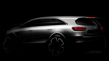
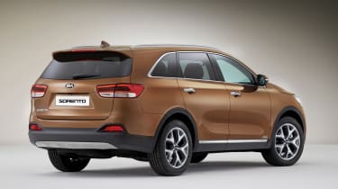
Mysterious teaser etching of the Kia Sorento went to extremes of the final design. The rear spoiler and window shape may look familiar, but the chunky wheels and smooth finish didn’t make it.
Even if these sketches are produced after the actual car has been designed, if a manufacturer goes too far with its exaggerated illustrations, it can backfire if the finished product looks totally different. “This can be self-defeating once the car is put on the real package and a realistic model is presented which doesn’t resemble the sketches any more,” designer A said.
Adding a touch of style
What the design sketch or illustration does allow a manufacturer to do, however, is show off a bit of flair. This is something that can be key for makers that don’t have the most stylish range of cars on the market. “Every company wants to tell a design story and so flashy sketches add to the drama. Every designer has to ‘stretch the truth’ to make their vision look more appealing to the management choosing the themes,” designer B explained.
While these drawings can show off a wilder side to a designer or manufacturer, problems can occur later down the line for a maker if it does try and retain some of the more unrealistic dimensions and features of the design drawings.
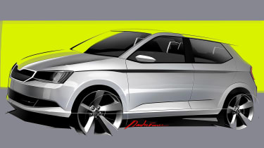
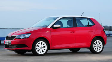
There doesn’t seem to be much difference between the Skoda Fabia and the illustration, but look closer and it’s clear the sketched version gets larger, protruding wheels and a lower roofline.
“I know a company where one car was designed all the way to a full-size model and then rejected a number of times. The 2D and sketch presentations always went well, only for the car to disappoint when it was made in to a full-size model,” designer A claimed.
“There was another car that had wheelarches which were out of proportion – they were much too big – if it had anything but the biggest optional 18-inch wheels fitted. The design manager always chose to present it with massive wheels to make the project proceed and beat other proposals. In the end the car didn’t look good with the usual 16 or 17-inch wheels it nearly always has in real life.”
Safety problems
The main stumbling block for manufacturers, however, is the increasingly stringent safety standards they have to adhere to. “The biggest constraint is pedestrian protection,” explained Matthew Avery, from motor insurance industry research body Thatcham. “You can’t have a small bonnet. Cars need to have a longish bonnet and flat front end to comply with new crash tests. Then there are more detailed things, such as the angle of the windscreen. This has to be right in order to stop the driver getting any glare.”
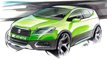
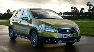
Illustrations for the Suzuki SX4 S-Cross took the extreme wheel approach to another level with barely any tyre visible. The window aperture and low-slung windscreen were also some way off the finished model.
It’s not just the exterior design that soon becomes watered down. The elaborate images of minimalist interiors and one-piece seats have to make way for more practical production parts. “The airbag has to be able to fit in the steering wheel and dashboard, so you have to think where this will be deployed,” added Avery. “For seats, you can’t have sculpted one-piece versions as they must have head restraints close to the head that are movable.”
Despite the constraints on manufacturers, and the potential pitfalls that come with the more elaborate attempts, the lure of creating something more stylish than the final product to tempt a buyer is often too great. As designer A admitted: “It would of course be better to have a more realistic, holistic approach to the design process, but unless that’s instilled from the top of a company then a designer is always going to try to make his work look as cool as possible, even if it’s not 100 per cent realistic."
Find a car with the experts
