Dacia Jogger review
The Dacia Jogger is one of the cheapest routes to seven-seat transport in the new-car market

Our opinion on the Dacia Jogger
If you’re looking for the cheapest seven-seat car for sale today, then you’re looking at it. But there’s more to the Dacia Jogger than just passenger carrying, because it’s a practical estate car that offers versatility and low running costs, and it just so happens to have a third row in the boot.
It doesn’t have any fancy tech or design touches, sure, but the no-nonsense approach hasn’t done Dacia’s other models any harm. It hides its budget roots very well – it’s only really noticeable in the quality of some of the materials used in less obvious places in the cabin – while the line-up of frugal petrol and hybrid powertrains offers enough performance for family duties.
| Key specs | |
| Fuel type | Petrol, hybrid |
| Body style | Five-door, seven-seat crossover estate |
| Powertrain | 1.0-litre 3cyl petrol, front-wheel drive 1.6-litre 4cyl petrol, plus 1x electric motor, front-wheel drive |
| Safety | One-star Euro NCAP (2021) |
| Warranty | Three years/60,000 miles |
About the Dacia Jogger
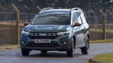
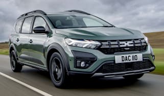
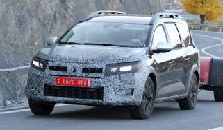
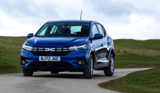
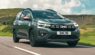
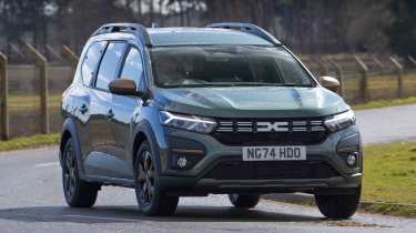
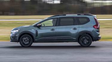
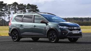
If the Dacia Jogger has a familiar look, that’s because all of the bodywork from the front doors forward is shared with the Sandero supermini. It uses the same running gear as the hatchback, too, but the Jogger adds a longer wheelbase, a raised roof and extended rear end to give it a look somewhere between an estate, a crossover and an MPV.
Unlike van-based seven-seaters that have sliding side doors, the Jogger retains conventional doors, while there’s an estate-style top-hinged tailgate at the rear. Inside is a seven-seat cabin, with a pair of removable chairs in the boot, so you can choose between taking passengers and maximum cargo capacity.
There is a choice of two engines, a 1.0 TCe three-cylinder turbo petrol with a manual gearbox, or a 1.6-litre four-cylinder petrol-electric Hybrid auto. Both are front-wheel drive.
Used - available now

2024 Dacia
Jogger
10,227 milesManualPetrol1.0L
Cash £14,400
2022 Dacia
Jogger
42,347 milesManualPetrol1.0L
Cash £12,300
2023 Dacia
Jogger
14,482 milesManualPetrol1.0L
Cash £16,300
2023 Dacia
Jogger
21,035 milesManualPetrol1.0L
Cash £15,785Trim levels kick off with the Essential model, which starts at just under £19,000 and comes exclusively with the 1.0 TCe powertrain. For around £1,200 extra you can upgrade to Expression trim, which adds a few more useful pieces of tech and luxuries, while the top-spec Extreme is another £1,000 on top of that.
If you’re looking at the Jogger Hybrid, then it’s just offered in Expression and Extreme trims, priced at around £23,500 and £24,500 respectively.
Performance & driving experience
| Pros | Cons |
|
|
The two engine options in the Dacia Jogger suit the car’s character. The 1.0 TCe turbo petrol is a unit that is familiar from elsewhere within the Dacia and Renault empires, and here it’s tuned to make 108bhp and 200Nm of torque. It features a familiar three-cylinder thrum that makes it sound sporty even if the performance is only modest at best, although there is a clear increase in pace once the turbocharger is spinning. There isn’t enough power on tap to overwhelm the front tyres, though.
The six-speed manual gearbox has a reasonable enough shift, although there is a slight vagueness here that you wouldn’t find in manual-equipped models from the Volkswagen Group, for example.
Turning to the 1.6 Hybrid powertrain, this features an automatic gearbox and two electric motors. It’s the same system used in the Renault Clio and Dacia Duster, and here it makes 138bhp and 349Nm of torque. The set-up sees one electric motor act as a starter-generator, while the other provides power to back up the petrol engine.
In everyday use, the electric motor fills in the power band as the engine gets up to speed, and it means the powertrain delivers decent responses. There isn’t the kind of high-revving that you get from other hybrids such as the Toyota Yaris, because the powertrain seems to favour electric drive over the petrol part of the system.
It’s an effective set-up when accelerating, but it’s a little trickier to keep a constant speed. The system seems to want to switch between electric and petrol modes all the time, so you’re constantly adjusting your foot on the throttle to maintain momentum, which can be a little frustrating.
Performance, 0-60mph acceleration and top speed
The 1.0 TCe turbo petrol is a fairly conventional unit, and a 0-62mph time of 11.2 seconds isn’t anything to write home about. If you’re going to be carrying passengers regularly, you might find that the engine struggles to cope with a lot of people on board. If you’re able to reach it, there’s a top speed of 108mph on offer.
The 1.6 Hybrid is far livelier, with a 0-62mph time of 10.1 seconds. There’s faster initial acceleration as the electric motor provides power, while this tails off a little as the petrol engine takes command. Surprisingly, the Hybrid has a lower top speed than the TCe, at 104mph.
Town driving, visibility and parking
The Jogger is relatively compact for a seven-seater, with a long, narrow body where most other options are wide. That means it’s just as easy to manoeuvre as the Dacia Sandero at low speeds, and the light steering also helps you to thread through small gaps. There’s a bit more length to deal with, but rear parking sensors are standard on all cars, so that will take some of the strain out of reversing.
The Hybrid version only has a small battery, so it won’t run on electric drive for very long when accelerating, but there is a B mode that allows for energy recovery when coming to a halt. This is useful because the brake pedal itself is a little inconsistent with its feel, so it’s better to use B mode and coast as much as possible.
All versions of the Jogger come with 16-inch wheels – alloys only for Extreme trim – so the ride is comfortable at urban speeds.
B-road driving and handling
Go faster, and it’s clear that the Jogger is set up for comfort. The ride remains pliant and relaxing, while the controls offer decent weighting. There is a bit of body lean in corners, but nothing that is likely to cause upset with passengers.
The Hybrid version feels punchy, and once past 43mph the engine takes over as the primary power source. The only sign that it’s running is a gentle hum from under the bonnet, because there’s no shunt in the transmission as it switches over. And even when you’re accelerating harder, the engine remains relatively refined.
Motorway driving and long-distance comfort
At higher speeds the 1.0 TCe just about copes with keeping pace with traffic, although having a full load on board is likely to be a struggle when the road gets steep. There’s a bit more road and wind noise on the motorway, a sign perhaps of where Dacia has cut costs, with less sound deadening being fitted here than in more expensive models.
The Hybrid is a better option for fast work, although we’d recommend activating the standard-fit cruise control to let the car maintain speed on longer trips – your right foot is likely to ache from trying to do the same job as you constantly make adjustments to try and stick to one speed.
Expert view, on driving experience
“One appealing aspect of the Jogger is that it feels just like a supermini to drive. Some people might be more intimidated by larger van-derived people carriers because of their size and boxy proportions, but with the Dacia there aren’t any issues like that.” - Dean Gibson, senior road test editor, drove the Jogger in a seven-seater shootout
| Model | Power | 0-62mph | Top speed |
| Jogger 1.0 TCe | 108bhp | 11.2 seconds | 108mph |
| Jogger 1.6 Hybrid | 138bhp | 10.1 seconds | 104mph |
MPG & running costs
| Pros | Cons |
|
|
List prices that kick off from less than £24,000 and would barely break £28,000 even if you loaded every imaginable option show that the Dacia Jogger offers some seriously impressive value for money. And that value character continues once you’ve been handed the keys.
The most economical model in the Jogger line-up is the 1.6 Hybrid in Expression trim, which has a claimed WLTP best of 58.9mpg, while the Extreme isn’t far behind at 57.6mpg. In comparison, the 1.0 TCe manages 47.9mpg in Essential guise, while the higher-spec trims have better quoted fuel economy, both at 48.7mpg. All versions of the Jogger come with a 50-litre fuel tank, so a range of more than 500 miles is feasible in the 1.0 TCe, and more than 600 miles for the Hybrid, if you can match the official figures. When we tested both the TCe and Hybrid models, we came close to matching the official figures, so this is entirely feasible.
| Model | MPG | CO2 | Insurance group |
| Jogger 1.0 TCe | 48.7mpg | 132g/km | 13 |
| Jogger 1.6 Hybrid | 58.9mpg | 108g/km | 15 |
Insurance groups
Due to its low cost, the Dacia Jogger has cheap insurance ratings. They fall in line with the engines offered, not the spec level, so the TCe cars all fall into group 13, while the Hybrid versions are in group 15. That’s still pretty low for a car with modern, more complex petrol-electric tech on board.
Tax
The Jogger comes nowhere near the £40,000 luxury car tax threshold, and since the £10 alternative fuel discount is no longer offered, road tax costs the same for the Hybrid as it does for the TCe models.
Business users will benefit from the lower emissions of the Hybrid model over the TCe. The latter is quoted at 132g/km, which places them five tax bands above the Hybrid models, which have figures of 108g/km and 109g/km respectively. If you must have a seven-seat company car, then PHEV or all-electric models are available that offer even lower Benefit-in-Kind (BiK) costs.
Depreciation
Residuals in the range of 57-62 per cent mean that the Jogger is one of the better performing cars on the market as a whole. The higher figures are for the Hybrid models, too, demonstrating their desirability with buyers. In comparison, a seven-seat Peugeot E-Rifter is in the 42 per cent region.
Interior, design & technology
| Pros | Cons |
|
|
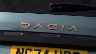
The Jogger’s exterior is a no-nonsense affair, although higher-spec cars are enhanced by off-road inspired plastic cladding and skid plates. The Extreme model also benefits from copper-coloured detailing, although we think that Cupra might have something to say about this design flourish.
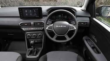
The cabin follows a similar theme, with a simple layout that foregoes any flashy design statements for a logical arrangement of the climate and infotainment controls. As with the exterior, top-spec Extreme models add some more distinctive details, but overall it's a fairly straightforward affair.
Interior and dashboard design
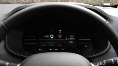
The dashboard layout is practical and user-friendly, with rotary controls for the heating and ventilation instead of a touchscreen-based system. One difference between the petrol and hybrid Joggers is with the dials. TCe cars get a basic set of analogue dials; the Hybrids feature a seven-inch digital display that shows efficiency-related information, including power flow between the wheels, motor, battery and engine. It's not as customisable as some digital cockpits, but the graphics are crisp.
Materials and build quality
There’s plenty of hard grey plastic inside, but that’s in line with the Jogger’s van-based MPV contemporaries. However, a soft plastic top and fabric inserts have been added to the dashboard to boost the cabin’s appeal. All models feature fabric upholstery, with a more upmarket finish for Extreme trim to help it stand out.
Infotainment, sat-nav and stereo
There is a distinct demarcation between the base version of the Jogger and the other two variants, because Essential trim does exactly as it says, by having the bare minimum these days of a DAB radio, Bluetooth, only two speakers and a smartphone holder on the dashboard for you to use your own device for anything more advanced.
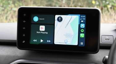
This is a neat solution for those on a budget, but moving up to Expression trim introduces an eight-inch touchscreen with phone mirroring via USB, plus four speakers in the cabin. Extreme adds navigation to the same display, plus wireless mirroring and a six-speaker stereo. In addition, a phone cradle borrowed from Renault’s vans is also fitted so you can still have your device mounted on display.
The infotainment system is basic, but it works reasonably well. The home page is split into six tiles for key functions, although they don’t always respond immediately and occasionally need to be tapped twice to open a sub-menu. One criticism we have is that the screen doesn’t automatically adjust for brightness and needs to be adjusted manually for day or night driving.
Expert view, on design
“We particularly like the neoprene-style fabric inserts on the seats in the Extreme model that are more interesting to the touch than regular fabric. The surface is wipe-clean which should be useful for family life.” - Dean Gibson, senior road test editor, drove the Jogger in a seven-seater shootout
Boot space & practicality
| Pros | Cons |
|
|
The Jogger looks like a Sandero supermini that’s been stretched and made slightly taller to turn it into an estate car, and the result is that there’s plenty of space inside. The seven-seat arrangement adds versatility, although if you don’t need the rearmost row you can take them out completely and turn the Jogger into a spacious five-seater.
Dimensions and size
Line the Jogger up next to a Sandero, and you’ll see that they’re the same width, but the former measures nearly half a metre longer and has a wheelbase that’s nearly 30cm longer (2,897mm to 2,589mm). It also has a taller roof to create more headroom in the back. There aren’t many other cars with similar proportions, with the most direct rivals being boxy van-based MPVs with sliding side doors.
| Dimensions | |
| Length | 4,547mm |
| Width | 1,848mm |
| Height | 1,691mm |
| Number of seats | Seven |
| Boot space | 160-2,085 litres |
Driving position, seats & space in the front
Up front the layout is identical to the Sandero, so there is enough wheel and seat adjustment on offer for most drivers to get comfortable. There is height adjustment for the seat, which isn’t always offered at this price point.
Storage is decent, although the Essential model only has an open tray between the front seats instead of the armrest bin found on higher-spec cars. That’s tall and square, while twin hexagonal cup-holders feature ahead of it, plus there’s a tray ahead of the gearlever. The glovebox and door bins are deep, too.
Seats & space in the back
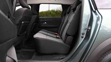
Room in the middle row is fine, although three-abreast seating can be a little tight. That’s because the Jogger is the same width as a Sandero, but a longer wheelbase and taller roof means there’s more head and legroom on offer. The seats themselves are set higher than the front ones, so you sit tall, but the slightly raked stance of the Jogger means that taller occupants get a view of the car’s headlining rather than through the windscreen. Large side windows make up for this. There are two USB sockets available and reasonable door bins, while tray tables can be added as part of the optional Storage Pack that costs around £160.
Access to the rearmost row is a little tight. Fabric pulls unlatch the middle row which then tumbles forward, but the car’s shape means you still need to squeeze in to get to the back. The rear seats are fixed in place, and space is decent on the whole, with only kneeroom for taller passengers being restricted. Storage includes a couple of cup-holders, plus there’s a USB socket, a 12-volt supply and pop-out rear windows for ventilation.
Boot space
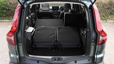
With all seven seats in place, Dacia quotes a capacity of 212 litres, which is room enough for a couple of bags of shopping. The back seats fold to create 699 litres of space, or there’s a healthy 820 litres when they’re removed completely, which is two and a half times larger than the Sandero’s boot. With the back seats folded, the Jogger has 2,085 litres of space and a relatively flat floor until you get to the chairs that have been tumbled forwards. Access to the boot is fine, although taller users might bang their head on the boot latch when the tailgate is open.
Expert view, on practicality
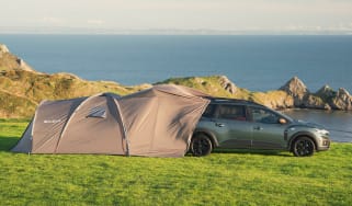
“If you’re the adventurous type, then Dacia offers the £1,800 Sleep Pack that turns the rear of the Jogger into a bedroom. If you want more space, the £2,100 Sleep Pack Plus adds a tailgate tent for proper outdoor living.” - Dean Gibson, senior road test editor, drove the Jogger in a seven-seater shootout
Reliability & safety
| Pros | Cons |
|
|
There’s a one-star Euro NCAP rating for the Jogger, but before you go thinking that it’s a dangerous car for transporting your family, you need to look at that in context. For starters, the car hasn’t actually been tested by Euro NCAP, instead the one-star rating is a transposition of the two-star score earned by the mechanically identical Sandero Stepway in 2021. The Jogger was docked a star because there was no seatbelt reminder for the rearmost row, while the rating also reflects a lack of hi-tech electronic safety kit.
Dacia has updated the safety kit since the test, with traffic sign recognition, lane departure warning and lane keep assistance, autonomous emergency braking system and a driver monitor all fitted. Expression cars and above add a blind spot warning system and an electric handbrake, too.
The Jogger hasn’t appeared in the Driver Power owner satisfaction survey results, although the Mk2 Dacia Duster managed to place at the top of the list in 2024. Dacia as a brand finished 22 out of 32 in the manufacturer rankings – up from 27th in 2022 and 26th in 2023.
| Key standard safety features | Euro NCAP safety ratings |
|
Buying and owning
- Best buy: Dacia Jogger 1.6 Hybrid Extreme
With such low prices on offer, we’d pick the top-spec model for all of its additional luxuries and a sharper look. And we’d pick the Hybrid because it offers a better drive and improved fuel economy over the TCe version.
Dacia offers a three-year/60,000-mile warranty for the Jogger, and roadside assistance lasts for the same period. However, the Dacia Zen package allows owners to extend their warranty for up to seven years or 75,000 miles with annual dealer servicing. The Hybrid’s battery is covered for eight years or 100,000 miles, but a degradation limit of 63 per cent capacity is greater than most manufacturers, who mostly cover a pack to 70 per cent.
The Jogger needs maintenance every year or 18,000 miles, whichever comes first. There are service plans available to help spread the cost, with a typical three-year/30,000-mile package costing around £600.
Alternatives
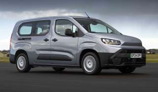
There isn’t really a direct alternative to the Dacia Jogger - no other new car with seven seats costs as little, so you’d need to choose a used car to match its value. The only models that come close on the new-car market are van-based MPVs such as the mechanically identical Ford Tourneo Connect and Volkswagen Caddy, plus the Citroen Berlingo and its Fiat, Peugeot, Vauxhall and Toyota spin-offs. Some of these come with diesel power that will be attractive to long-distance drivers, while the Ford is also offered with plug-in hybrid technology, and the Citroen et al come in full electric guise, too.
Dacia Jogger pictures
Frequently Asked Questions
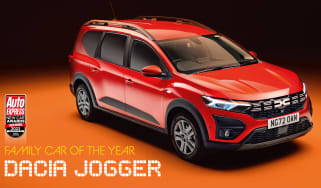
If you’re in the market for the cheapest seven-seat car that money can buy, then the Jogger is your port of call. It offers good practicality, low running costs and decent handling, which we’d say makes it a great choice. We even named it Best Family Car in our New Car Awards in 2022 and 2023.

