Mazda KAI Concept previews 2019 Mazda 3 at Tokyo
Mazda's latest design language uncovered with the bold KAI Concept, which has been revealed at the 2017 Tokyo Motor Show
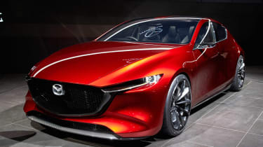
The Mazda KAI Concept has been styled to be built, according to the company’s European design chief.
The dramatic 2017 Tokyo Motor Show concept is said to give us an early preview of the look of the next generation of Mazda 3. The KAI demonstrates how Mazda’s Kodo design language could evolve to include even fewer visual elements, with cleaner, less cluttered surfacing that still manages to give a dramatic look.
Kevin Rice, Mazda’s European design director, told Auto Express that while the company has yet to officially confirm that KAI is anything other than a show car, it has been created with manufacturing techniques in mind. “We have a recent history of not just producing concepts for concepts’ sake,” he said. “So yes, manufacturing tolerances and techniques have been incorporated into this project since the very beginning. We’re working with our manufacturing guys on new techniques - in particular, new stamping and pressing techniques - that would allow us to form the type of shapes on the KAI, and also for them to stay in place.
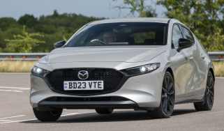
“The concept shows how our Vision Coupe could look if it were a C-segment hatchback,” he added. “It’s actually a little bit shorter than the current 3, but because it’s sitting so much lower, and it’s wider, it looks longer. Obviously if it were to go into production its stance would need to change; it’d move upwards and we’d need to reprofile it to work with smaller wheels [the KAI sits on 20-inch alloys]. But we’re pleased with how it shows surface texture without any creases.”
One key area of this is around the C-pillar, where the KAI has more than a hint of the original Mk1 SEAT Leon about it. “We made the panel behind the rear door larger to allow us to sweep right down from the roof and fade into the side of the vehicle,” Rice said. “There is actually a change of shape in there but you don’t see it initially because we haven’t had to use a hard crease to achieve it. That’s really what the evolution of Kodo design is about.”
Against the tape measure, the KAI is ever so slightly shorter than the current Mazda 3. It’s significantly shorter in height, too, at 1,375mm. The wide appearance is backed up by the on-paper figures, though – it’s 60mm wider (at 1,855mm), while the rear wheels are pushed right up to the bumper thanks to a wheelbase that has been stretched by 50mm.
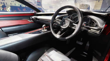
Inside, the smooth exterior design is reflected by a clean-looking layout, with a horizontal dashboard spanning door to door. A widescreen infotainment system stretches from the passenger door to the steering wheel, but the car foregoes a fully digital instrument display in favour of three evenly spaced dials.
Finally, a thick transmission tunnel separates the driver from the front seat passenger, while bright red trim accents match the exterior paint colour.
What do you think of Mazda's KAI concept? Let us know in the comments section below...
Find a car with the experts
