Used Mercedes GLE (Mk1, 2012-2019) review: rebadged M-Class is posh but expensive to run
A full used buyer’s guide on the Mercedes GLE covering the GLE Mk1 that was on sale between 2012 and 2019
Verdict
While the original ML-Class wasn’t very impressive, the second take was a more accomplished car, and Mercedes built on this for the ML Mk3/GLE. With strong and efficient engines, plenty of space and a luxurious cabin, the GLE feels every inch the premium product, but you’ll need deep pockets to buy and run one.
This is also a superb towcar thanks to its high hauling capacity and four-wheel drive; this last item gives year-round security, too. Those intending to use their GLE off the beaten track should also seek out the rare off-road pack; this includes under-body protection, a centre differential lock, a low-range gearbox, extra off-road ride height settings and more driving mode options.
Mercedes’ first attempt at a luxury off-roader was the ML of 1998, and it was pretty underwhelming. The Mk2 that followed in 2005 was much better, but it was the third-generation ML of 2012 that really hit the spot.
This was renamed GLE in 2015, with a GLE Coupé coming first (to rival the BMW X6), and the direct ML replacement soon after.
The GLE was more expensive than most of its key rivals, so it wasn’t always easy to recommend when new, despite the excellent engineering and superb safety credentials. But, as a used buy, these hefty Mercs make more sense, even if steep running costs are likely to be part and parcel of ownership.
History
The third-generation ML was launched in March 2012 in four-cylinder ML 250 Bluetec and V6 ML 350 Bluetec diesel forms. Two months later the 525bhp twin-turbo 5.5-litre V8 ML63 AMG arrived. In March 2015 an ML coupé arrived, renamed as the GLE Coupe in 2015 and available only in GLE 63 S 4Matic form.
Used - available now

2023 MINI
Cooper Electric
9,994 milesAutomaticElectric
Cash £13,300
2022 Kia
Niro
15,751 milesAutomaticPetrol1.6L
Cash £17,400
2014 Ford
C-Max
47,279 milesManualDiesel1.6L
Cash £6,695
2019 Mercedes
GLE
54,000 milesAutomaticDiesel3.0L
Cash £23,600Soon after, the GLE 350d and GLE 450 Coupés arrived, with a GLE 43 AMG edition going on sale in 2016. In the meantime, in September 2015, the ML Mk3 was renamed GLE. It featured upgraded engines and a plug-in hybrid option, the GLE 500e 4Matic, with a 3.0-litre V6 petrol engine.
From here on, the AMG range-topper was the 585bhp V8-powered GLE 63 S 4Matic. An all-new Mercedes GLE arrived in 2019 to replace this car.
Which one should I buy?
Either diesel provides decent performance and reasonable economy; the six-cylinder 350d is thirstier but more muscular. The ML-Class came in SE, AMG Line and AMG Sport trims; the GLE got AMG Line or AMG Night Edition trims, although only the latter was offered for the final part of its life.
AMG Line has artificial leather trim, 20-inch alloys, LED tail lights, climate control, a powered tailgate, plus automatic lights and wipers. The AMG Night Edition adds LED headlights, active parking assist and electric memory heated leather seats.
The Driving Assistance Plus package adds blind-spot warning, adaptive cruise control and lane-keep assist, so it’s worth finding cars with this fitted. The same holds for the Dynamic Package, with adaptive damping, air suspension and 21-inch wheels.
Alternatives to the Mercedes GLE
A Range Rover provides a sense of occasion the Mercedes can’t match, but running costs are high, while reliability reports are less than glowing. The same applies to the Range Rover Sport, which is better to drive but more costly than an equivalent GLE.
The Porsche Cayenne and BMW X5 are also good to drive, but again, purchase and running costs tend to be higher. The Jeep Grand Cherokee doesn’t have the Merc’s build quality but is superb off road, and purchase costs are relatively low – although the running costs certainly aren’t.
A VW Touareg is well equipped, has a great cabin, is comfortable, and comes with excellent engines, while the hybrid Lexus RX450h is superbly built, refined and well equipped, but not so great to drive.
What to look for
Electrics
The electrics are generally robust, but some of the sensors, switches and motors do fail, and repairs tend to be costly.
Suspension
The air set-up is worth having for the benefit of improved comfort and dynamics, but it’s less reliable than the standard steel springs.
Towing
Be aware that a GLE used regularly for pulling heavy loads might well have tired and worn out brakes, suspension and transmission.
Five seats
The GLE comes with no seven-seat option. You must trade up to a GL (later known as the GLS) to get seven seats.
Interior
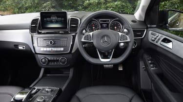
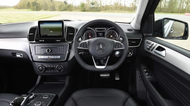
You can see where your cash is going inside. The fit and finish are superb, as are most of the materials, while the GLE’s cabin is bursting with equipment. The dash is easy to use once you’ve mastered it, but the infotainment isn’t as slick as rivals’. Cabin and boot space are good, but the big rear wheelarches hinder entry to the back. The boot holds 690 litres, or 2,010 litres with the seats folded.
Running costs
All GLEs need servicing every year or 15,500 miles. The schedule runs minor, intermediate, major; the only parts replaced in the minor are the oil and filter, plus an Adblue top up.
The intermediate service is largely a series of checks; the major includes new air and fuel filters. All engines are chain-driven, and long-life coolant should not need renewing. Mercedes offers monthly and up-front transferable service plans.
Recalls
The GLE has been recalled 12 times so far, and the ML Mk3 was recalled three times. GLE glitches include windscreen wiper, transmission, seatbelt and airbag issues. Power steering failure, the windscreen separating from the body in a collision, faulty rear brakes, transmission leaks and panoramic glass sunroofs working loose also prompted recalls.
Driver Power owner satisfaction
Neither the ML-Class nor the GLE have featured in our new or used Driver Power surveys. Mercedes did appear in our 2019 Brands survey though, in 26th place out of 30 companies. Across the maker’s models the lowest scores were for running costs and ride/handling, with no scores in the top 10.
Mercedes GLE (2015-2019) review: what we said
Extracts from our 2019 in-depth review of the Mercedes GLE...
Luxury SUVs are ten a penny these days, and unfortunately the Mercedes GLE-Class is falling behind the front-runners in the pack thanks to its ageing design. It's a big, heavy SUV that majors on comfort, but not a lot else, as rivals offer more space, better technology and a more engaging driving experience.
The AMG models are fast in a straight line, but running costs are steep, although the V6 and V8 engines offer plenty of torque for towing. The GLE has roots that can be traced back over a decade, though, and that means it can't match its rivals for running costs or ease of driving, while the interior isn't the most spacious.
The Mercedes GLE is a luxury SUV that slots in between the smaller GLC and huge seven-seat GLS in the Mercedes SUV line-up. The GLE name connects it with the E-Class executive, so gives an idea of its size and the kind of engines and trims you can get it in. However, while the all-new E-Class is a front-runner in the executive class, the GLE has more in common with the previous generation E-Class in terms of tech, engines and quality.
That's because while the GLE has been on sale since 2015, it can trace its roots further back to 2011, as it's essentially a rebadge of the Mk2 ML-Class that was launched that year. That means the GLE is a distant relative of the Jeep Grand Cherokee, as both were initially developed together before parent firms Daimler and Chrysler when their separate ways.
Anyway, back to the GLE-Class. While the name was changed in 2015, most other things stayed the same. The only big update was the introduction of the GLE Coupe, a more expensive, less spacious but more stylish SUV designed to rival the BMW X6. Engines included GLE 250, GLE 350 and GLE 450 variants with four or six cylinders, although today the standard range is pared down to just 250 and 350 variants as Mercedes winds down production in advance of an all-new GLE arriving in 2019.
The GLE 250 d is a four-cylinder model with Mercedes' ageing 2.1-litre unit under the bonnet. It's the most efficient diesel GLE you can buy as the 204bhp unit has claimed economy of 47.9mpg. The GLE 350 d gets a 258bhp V6 diesel that's good for a claimed 37.7mpg, but if you're a company car buyer, then you'll want to have a look at the GLE 500e.
This model features a petrol-electric plug-in drive system that's good for 449bhp, but if you keep the battery charged up, you should be able to travel up to 19 miles on a charge before the engine cuts in, boosting your fuel economy. Company car users will also appreciate emissions of 78g/km which will help keep tax costs down.
At the other end of the spectrum are the AMG versions of the GLE. There's the V6 twin-turbo AMG 43, which has 390bhp and a 0-62mph time of 5.7 seconds, or there's the full-house V8 twin-turbo AMG 63, which has 585bhp and a supercar-rivalling 0-62mph time of 4.2 seconds. And if you want to know what kind of economy these models can achieve, then you're buying them for the wrong reasons.
All versions of the Mercedes GLE feature 4MATIC four-wheel drive and an auto gearbox, with a nine-speed G-Tronic on the 250 d, 350 d and AMG 43 models, while the 500 e hybrid and AMG 63 get a seven-speed G-Tronic box.
Engines, performance and drive
All GLE’s feature Mercedes’ Drive Select system, which allows the driver to adjust the weight of the steering and the throttle response, with Slippery, Comfort and Sport modes to choose from. On the 350d and above, the GLE also comes with Merc’s Airmatic air suspension with adaptive dampers, so the Drive Select dial will also change the firmness of the chassis depending on how you want to drive. However, even in the most comfortable setting, the ride can still be fidgety especially on AMG Line models.
Permanent four-wheel drive is also standard across the range – even on the 500e, so you can go off-road in zero emissions mode.
With an off-road pack that adds a locking centre differential and an extra ride height setting for the air suspension, the GLE is capable away from the tarmac, but it’ll likely spend most of its time on it.
The car rides well on the road in Comfort, although larger bumps do ruffle the chassis and it takes a while to settle back down and the body does sway around a little. Switch into Sport mode and the car is noticeably firmer – this controls the GLE’s sizeable bulk better, but it does hurt ride quality. The weightier steering means the car feels reassuring on the road, but there’s still very little feedback through the wheel. It’s no sports car, so it’s best to leave the GLE in Comfort and cruise.
Engines
The 2.1-litre four-cylinder turbodiesel in the GLE 250d puts out 201bhp, but more significantly 500Nm of torque at just 1,600rpm. This means the performance it serves up is acceptable, with the 0-62mph sprint taking 8.6 seconds. However, the 250d is grumbly at idle and sounds strained when you rev it.
The 3.0-litre turbo V6 diesel in the GLE 350d is a much nicer unit, with a big step up in torque to 620NM produced at the same revs. Along with 254bhp, it means much more performance, with the 0-62mph time coming down to 7.1 seconds. Top speed stands at 140mph compared to 132mph for the 250d.
Although it boasts incredible efficiency credentials, the GLE 500e hybrid is also surprisingly rapid thanks to the instantaneous torque developed by its electric motor. With a total of 346bhp and 650Nm of torque available, this big 2,465kg SUV is as fast as some sports cars, hitting 62mph from rest in 5.3 seconds and going on to 152mph.
Impressively, it’ll run at motorway speeds on electric power alone, while its all-electric range is around 18 miles depending on how you drive.
However, if you’re a real driving enthusiast and want the practicality of an SUV with the performance of a supercar, the AMG GLE 63 S perfectly fits the bill. The big V8 produces a lovely, deep rumble and will catapult the GLE from 0-62mph in 4.2 seconds, while its speed is electronically limited to 155mph.
MPG, CO2 and Running Costs
Compared to the entry-level BMW X5, the GLE 250d is just as efficient, returning 47.9mpg combined with 155g/km CO2, but it’s down on power significantly as the BMW boasts a 258bhp 3.0-litre diesel. The 350d isn’t as frugal as its X5 equivalent, the xDrive 30d, with on-paper fuel economy of 42.8mpg combined and 174g/km CO2.
The hybrid GLE 500e’s 78g/km CO2 total (84g/km on the smaller wheels) is impressive, but you’ll unlikely to hit the 76.4mpg quoted figure under real-world driving conditions unless you religiousl plug it in to charge it up.
We’d also recommend taking the AMG 63 model’s 23.9mpg predicted economy with a pinch of salt – weighing 2,345kg there’s a lot of mass the V8 has to move, so high teens would be a fair assessment. The 276g/km CO2 output means it’ll cost a lot for company car users to run.
Interior, design and technology
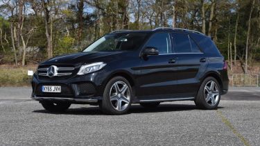
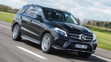
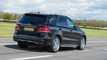
As with the GLE Coupe, the regular GLE’s nose is much sleeker compared to the square-set ML model it replaced. The headlights flow back into the wings, with the large radiator grille and Mercedes logo dominating the front-end design. Underneath there are another three large grilles that give the GLE even more visual presence.
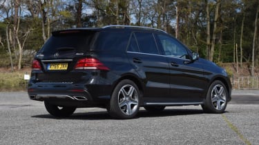
Moving away from the front and down the car’s sides, the overall shape looks more familiar, with minimal changes to the car’s panels. It’s much the same at the rear, with the most notable alterations over the old car a new set of taillights and a revised rear bumper that features chromed exhausts depending on the model.
Despite this, the visual makeover is still a success. Mercedes has blended its curvier design language with the boxy proportions of the old car to great effect and the GLE is definitely an improvement visually.
The cabin has also been overhauled, with a central tablet screen as part of the infotainment system. It’s flanked by two large air vents, but with a thick bezel around the edge of the display, it’s not quite as slick as systems in rivals like the BMW X5. It’s also not as intuitive to use as BMW’s iDrive either.
Practicality, comfort and boot space
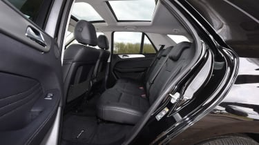
The GLE’s vast dimensions mean interior space isn’t a problem. There’s lots of room in the rear, with plenty of headroom and legroom, so longer journeys should be easy. Even short trips with three adults in the back should be fine.
There’s enough boot space to swallow five people’s luggage, too. With the rear seats up the GLE boasts 690 litres in its load bay – except for the hybrid, as the battery pack eats into the luggage compartment and cuts usable space down to 480 litres. It also raises the boot floor so you’ll have to lift bags even higher to get them in the back.
With big doors that open wide, access to the rear is easy, and with lots of glass area visibility is good. Plus the standard-fit reversing camera and parking sensors help with manoeuvring.
Unlike some rivals, the GLE-Class doesn't have the option of seven seats, although the car's packaging means that these would be rather cramped if they were offered.
Now you can buy a car through our network of top dealers around the UK. Search for the latest deals…

