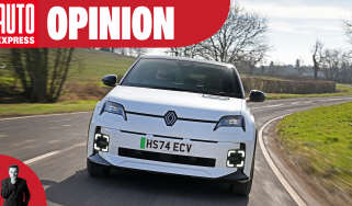
Renault 5 review
The retro-inspired Renault 5 electric supermini is well priced, nice to drive, and has great tech

Our opinion on the Renault 5 E-Tech
The automotive world has seen how well retro-inspired designs have worked for the likes of Fiat and MINI, so Renault has decided “why not?”.
The brand hopes that the latest Renault 5 has enough style to remind those of us old enough to remember the distinctive original, yet it balances that with a sharp, contemporary body that will attract younger buyers who simply want a striking small car.
But while the Renault 5 plays heavily on nostalgia, there’s so much joy in this little package that it’s impossible not to be impressed. It feels like a more compelling posh supermini than a MINI Cooper or Peugeot E-208, and it has just enough space inside, a decent electric range across both powertrain and battery options, plus a competitive price. While we would like a slightly more forgiving ride and a less abrupt stability control system, the R5 ticks all the boxes that make it one of the best options in the class.
About the Renault 5 E-Tech
The Renault 5 is designed to offer the sort of desirability that will tempt buyers away from the likes of the MINI Cooper and Fiat 500, along with a temptingly affordable price to challenge low-cost Chinese EVs, and it seems Renault isn’t looking too shabby on either front.
All versions of the Renault 5 E-Tech are front-wheel drive, while the only body option is a five-door hatchback. This is shared with the Alpine A290, which is the hot hatch variant.
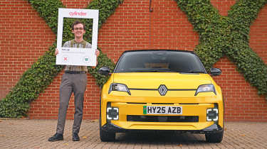
We've driven various versions of the Renault 5 since its launch, from the entry-level 40kWh version as part of our long-distance small EV range test, to the 52kWh Renault 5 we pitched against the Fiat 500. The Renault easily beat the Fiat thanks to its superior practicality, better range, excellent performance, and far greater refinement. We've even run a Pop Yellow Iconic Five (now called Iconic Five+) as part of our long-term test fleet.
Renault 5 prices and latest deals
How much does the Renault 5 cost? Well, official ‘on the road’ prices range from £22,985 to £30,685 but you can currently save an average of £2,542 through the Auto Express Find A Car service, where prices start at £21,050. Don’t want to buy? You can lease a Renault 5 from £249 per month.
Check out our latest new car deals and leasing deals for the top offers available now on Auto Express. And don't forget we can help you sell your car, too.
The Renault brand is among a growing number of manufacturers that qualify for the Government's Electric Car Grant (ECG) announced in July 2025. The 40kWh version of the R5 is eligible for the £1,500 'Band 2' grant, while the 52kWh models qualify for the full £3,750 'Band 1' grant. These grants are applied automatically when you buy.
Performance & driving experience
| Pros |
|
| Cons |
|
Renault has engineered a feeling of solidity into the way that the 5 behaves on the road. In terms of refinement and stability, it really doesn’t feel like a small car at all. It’s all very grown up and reassuring.
There are three drive modes, which make a fairly substantial difference to everyday driving, even if the overall performance remains relatively conservative. We’d skip the Eco setting. It doesn’t really do much to increase the overall range beyond making the throttle response very sluggish. The response in Comfort is very natural and progressive, while Sport mode sharpens things up further.
Performance, 0-60mph acceleration and top speed
Whichever version of the Renault 5 you choose, it features a single electric motor driving the front wheels. Renault offers buyers a choice of two e-motor outputs, each with its own battery size.
The range starts with a 118bhp version with 225Nm of torque; this motor is paired to a 40kWh battery, which returns a claimed 190-mile range. Its performance compared with similar entry-level EV is surprisingly sprightly enough on paper; 0-62mph takes nine seconds, which is identical to the Fiat 500, and is still several seconds faster than the Citroen e-C3 and BYD Dolphin Active.
We’ve spent plenty of time behind the wheel of the 148bhp model, not only as part of our twin test against the Fiat 500e, but also over 5,000 miles during our long term test. As well as the extra 30bhp over the entry-level car, it also gains 20Nm of torque, bringing its total to 245Nm. On the road, it feels every bit as quick as the 7.9-second 0-62mph time suggests.
It's a little behind the entry-level MINI Cooper E, which has figures of 176bhp and 280Nm, but the Renault is around 175kg lighter, which is impressive when you consider the MINI has a smaller 38kWh battery. Despite the Renault being 30bhp down compared with the base MINI Cooper E, its 0-62mph time is only around 0.7 seconds slower than the more potent MINI.
The R5’s throttle mapping is quite smooth – even in its most responsive Sport mode – so it’s easy to control the power at low speeds without the wheel-spinning moments that some rivals often provide. The motor is very quiet, and the feedback through the brake pedal is reassuring and smooth as it transitions between motor regeneration and mechanical braking.
The R5’s top speed is capped at 93mph, for the sake of both electric range and the e-motor’s gearing.
| Model | Power | 0-62mph | Top speed |
| Evolution 40kWh | 118bhp | 9.0 seconds | 93mph |
| Techno+ 52kWh | 148bhp | 7.9 seconds | 93mph |
Town driving, visibility and parking
While the Renault 5 has a solidity that is easy to feel even at low speeds, Renault has kept many of the typical small-car traits that make models such as this so much fun to drive around town. The steering is light and darty – but with a slightly strong self-centring effect around the straight-ahead – and the turning circle is impressively tight, so low-speed manoeuvres feel like they come naturally to the 5.
The ride is a little on the firm side. The damping is well controlled, so it rarely feels harsh, but there’s an ever-present bounce that’s familiar in any small EV with a short wheelbase – dealing with the mass proves to be quite a challenge for chassis engineers in these circumstances. That aside, the powertrain is smooth, the brake feel is reassuring, and a B mode increases the level of brake regeneration significantly, but not enough to offer complete one-pedal driving, which is among the few complaints our news reporter Ellis Hyde had about the car when he ran a Renault 5 Comfort Range Iconic as a long term test car. Seeing as the Renault 4, Renault Megane and Renault Scenic have one pedal drive, it seems possible that the 5 could get this in the future.
B-road driving and handling
Up the pace, and the Renault 5 is quite entertaining to drive. The low centre of gravity provided by the battery pack in the floor limits body roll, but not so much that you can’t feel what the car is doing beneath you.
Get bold through a corner, and you can even play with the 5’s balance on and off the throttle. It’s not quite as fun to drive as previous supermini handling stars such as the Ford Fiesta – or numerous French small cars before that – but it’s among the more entertaining small models you can buy today.
Motorway driving and long-distance comfort
That solid feeling pays dividends on a motorway. While this isn’t going to be most buyers’ first choice for a long-distance slog, the 5 is more than up to the task. It feels stable, refined and reassuring, and despite the straight-line performance tailing off beyond 60mph, there’s still more than enough in reserve to make great progress. Road and wind noise are impressively well contained for a car of this size, too.
“There’s a little bit of work to do with the Renault 5’s brakes: push the brake pedal at low speeds, and the regenerative braking will snap on without much subtlety, forcing you to concentrate harder than is ideal for town driving. With some acclimatisation, things improve, but the set-up in other vehicles is more intuitive.” - Jordan Katsianis, senior staff writer
Range, charging & running costs
| Pros |
|
| Cons |
|
Electric range, battery life and charge time
In a mix of driving environments, with temperatures around 17 degrees Celsius, we achieved 4.1 miles per kilowatt-hour in the 52kWh comfort range version, but that included motorway driving that uses more energy. Our long-term testing of a 52kWh Iconic model over 5,000 miles yielded an average of 4.0 miles per kilowatt-hour over a variety of roads, which is representative of what most people should be able to achieve. A heat pump is provided as standard to help maintain efficiency in colder weather, though we have seen efficiency drop to 3.3mi/kWh (around 170 miles per charge) in mixed driving (including motorways) when temperatures are around freezing. It's worthwhile in cold weather to use the car's app when plugged in, because you can preheat the interior before you set off in order to make the most of your range.
We've also tried the less expensive 40kWh version as part of our EV range testing and managed 3.9 miles per kilowatt-hour in mixed driving or 156 miles between charges based on the battery size.
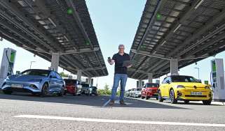
Renault claims that the big-battery 5 can charge at up to 100kW, but the best we saw was 87kW during our electric car charging speed test. However, while that is 13kW below its promised maximum, it still managed to go from 15 to 80 per cent state of charge in under 30 minutes. It took a further 34 minutes to go from 80-100 per cent state of charge, so our advice on long journeys is to unplug at 80 per cent and continue, stopping again later if needed to save time. The entry-level car has a lower maximum charging speed of 80kW, but due to its smaller capacity 40kW battery, it completes the same 15 to 80 per cent top up in a similar time.
Some electric vehicles, including Teslas and VW Group products, can precondition the battery in advance of reaching a charge point so you get the advertised speeds straight away. It’s a feature that we’d like to see on the 5 in future, because our testing has found that on arrival at a rapid charge station, initial charging speeds are sluggish, before improving significantly once the battery warmed.
| Model |
Battery size | Range |
Insurance group |
| Evolution 40kWh | 40kWh | 192 miles | 18 |
| Techno+ 52kWh | 52kWh | 252 miles | 22 |
Insurance groups
Depending on the trim and powertrain you choose, the Renault 5 ranges from insurance groups 18 to 22. That’s fairly low relative to its closest rivals; the MINI Cooper E, for example, ranges from groups 20 to 26.
Tax
Being an EV that falls well below the revised £50,000 luxury car tax threshold (it comes in from 1 April 2026 but has been applied retrospectively to cars registered from 1 April 2025), this Renault is cheap for private buyers to tax. The first year’s VED stands at £10 (up from £0 pre-April 2025), and will cost £195 a year in road tax. The Renault 5 should also be a more affordable choice to run as a company car compared with a petrol- or hybrid-powered supermini.
It is worth bearing in mind the potential plan to introduce an eVED pay-per-mile fee for EVs, which may come into force from April 2028.
Depreciation
Renault has priced its models reasonably competitively from the outset, and that’s reflected in the predicted residual values across the range. On average, the Renault 5 range is expected to hold onto between 47 and 50 per cent of its original cost after three years or 36,000 miles.
Some trim levels of the MINI Cooper Electric hold on to a little more value over the same period, but the Renault resists depreciation more doggedly than other small electric hatchbacks, such as the Peugeot E-208, Vauxhall Corsa Electric and Fiat 500.
To get an accurate valuation on a specific model check out our free car valuation tool...
Interior, design & technology
| Pros |
|
| Cons |
|
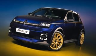
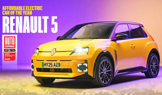
Renault has done a lot of work to reinterpret the iconic Renault 5. The original sold in the millions and was born from the brilliant and esoteric designer Michel Boue. To reimagine it for the modern age could have been a minefield; appropriating something so iconic into something modern can easily take a wrong turn. This is something that Renault’s design team under Laurens van den Acker has largely avoided. The design has plenty of references to the old car, such as the rather large oblong feature on the bonnet of Techno+ trim models and above, which on the original housed an air vent on the original, but here acts as a battery charge indicator.
Of course, there are a few concessions to modern trends – the bi-colour body colour options and framed wheelarches, for example – but these don’t take away from the originality that has been applied where appropriate. Available in a blindingly bright metallic green or yellow, plus a more subdued range of white, black and navy blue, these can be highlighted with coloured trim strips and optional graphics where applicable.
The entry-level Evolution features 18-inch wheels, LED headlights and rear parking sensors as standard. There’s a 10.1-inch touchscreen with Apple CarPlay and Android Auto smartphone connectivity.
Techno+ trim comes with the more potent 148bhp motor with the large 52kWh capacity battery pack. In terms of kit, it adds Google infotainment tech with battery preconditioning and route planning, wireless phone charging, adaptive cruise control, and a reversing camera.
However, we recommend the Iconic Five+ because it comes with all the features EV drivers want, along with some genuinely premium features, such as:
- Heated front seats and steering wheel
- A Harman Kardon sound system
- Lane centring assistance
- Blind-spot warning
- Front parking sensors
- An automated parking system
Tennis fans may be seduced by the top-of-the-range Roland Garros+ trim, which is the only R5 to get a leather trim option (synthetic leather), and a few tennis-themed details, such as the gear selector wrapped like the handle of a tennis racket. It doesn't add any useful additional equipment, though, so we don't think it's worth going for above the better value Iconic Five trim.
Interior and dashboard design
Renault has leaned into its heritage with the 5’s cabin. The fabric-covered dashboard and the distinctive shape of the seats are inspired by the first-generation 5 from the seventies, while the pronounced shelf ahead of the passenger and prominent air vents pay homage to the Mk2 ‘Supercinq’.
That this is all integrated into the overall design alongside modern creature comforts such as digital displays and physical climate control functions, is a great achievement.
While the MINI and Fiat 500 play on their retro designs and feel similarly special, the Renault has the most logical ergonomics of the three. The one small exception is the gear selector. The spindly column stalk is mounted just above the control for the wipers, and we found that it was quite easy to inadvertently knock the wrong one when quickly switching between drive and reverse, for example, when parking or doing a three-point turn. Given that there is a third stalk on that side further down – Renault’s otherwise very intuitive volume and media controls – it feels a little cluttered in that area.
Materials and build quality
Overall build quality is solid enough for a small car. It’s not quite as posh-feeling as the latest MINI’s cabin, but the few hard plastics inside the 5 tend to be low down, with fabric pieces covering the bits closer to hand.
Iconic Five+ models at the top of the range feature a modern-feeling yellow and grey fabric across the seats, which looks like it should wear well, with a contrasting black vinyl on the dash with yellow stitching. This definitely lends a sense of high quality to the cabin and serves as a nice reference to the original, but the slightly shiny, leather-like material did make it look a little like a rolled and trussed loin of pork ready for the oven. Lesser models come with denim-like fabric across the dash, and the seats look a little more modern and less like the inside of a butcher’s shop in greyscale.
On the whole, the important elements, such as the dash front, door cards, seat controls and steering wheel feel sturdy and well-made, but there are some flimsy plastics used on parts such as the boot grab handle and rear doors.
Infotainment, sat-nav and stereo
The digital instrument panel ahead of the driver is sharp and easy to read, with a layout that varies depending on your chosen driving mode. Fundamentally, your speed and the main information hub are static and sit either at the centre of the screen or to the right, with a central section that can be brought up to show active driver aids, efficiency info or fully embedded Google Maps navigation.
The central touchscreen uses Renault’s latest OpenR Link infotainment set-up leans heavily on Google-based tech. Using the know-how and operating system from a tech giant means that it’s far better than Renault’s previous touchscreen attempts when going it alone – and it’s better than other manufacturers’, too. Built-in Google Maps is brilliant for route planning and locating charging points, and the loading and response times are better than most systems at any price. It was the best feature of its infotainment system according to our infotainment mega test, allowing quick adjustments based on the driver's preferences, charging locations and latest traffic data.
Bluetooth is quick and simple to set up, and we had no problems with connection or sound quality. Speaking of which, the Harman Kardon sound system is very good for the class, easily rivalling the same system found in an equivalent MINI. You'll also find Renault's useful audio remote control stalk on the steering column, which, once you've become accustomed to it, allows for quick adjustments of the volume, radio tuning, and incoming phone calls.
The 5 stands out for retaining physical climate controls, which make adjusting basic settings feel very intuitive from the second you get behind the wheel.
“If we have one gripe with the infotainment system, it’s with the Renault personal assistant. Called ‘Reno’ (pronounced ree-no), it reminded us of the Microsoft paperclip in both appearance and general irritation.” - Jordan Katsianis
Boot space & practicality
| Pros |
|
| Cons |
|
There’s one body available for Renault’s supermini-sized EV, and compared with a traditional supermini, or even a crossover model such as the Citroen e-C3 or Fiat Grande Panda, the R5 will seem tight inside. This is largely due to the fact that Renault has prioritised boot space over rear legroom.
The dark interior roof lining (cool though the waffle pattern might be) and narrow windows accentuate this, but it’s by no means claustrophobic. There are five seats on all models, and while legroom is at a premium, the lack of a central tunnel in the rear footwell, and a relatively wide body mean it’s not too short on foot space.
Dimensions and size
At 3,922mm long, the R5 is a full 128mm shorter than the familiar Renault Clio and 165mm shorter than the Renault Zoe that it replaced. However, it’s still 64mm longer than another compact retro small car whose success the R5 will hope to emulate, the MINI Cooper.
| Dimensions comparison | |||
| Model | Renault 5 | MINI Cooper E | Fiat Grande Panda Electric |
| Length | 3,922mm | 3,858mm | 3,999mm |
| Width | 1,774mm (2,020mm inc mirrors) | 1,756mm (1,967mm inc mirrors) | 1,763mm (2,017mm inc mirrors) |
| Height | 1,498mm | 1,460mm | 1,570mm (Pop trim) |
| Wheelbase | 2,540mm | 2,495mm | 2,540mm |
| Boot space | 277-959 litres | 210-800 litres | 361-1,315 litres |
Seats & passenger space
The 5 feels quite substantial for such a small car in the front. The dash is fairly high, so those wanting a great view out will need to jack the seat up a little.
Fortunately, the front seat and steering wheel offer lots of adjustment, so it’s not hard to find a comfortable seating position. But the large outer rear headrests obstruct part of the driver’s view out of the back window.
The rear seats are comfortable, but predictably for such a small car, they’re not incredibly spacious. Knee room is similar to a Vauxhall Corsa, so there’s less than in the roomiest hatchbacks on the market, such as the Skoda Fabia. Headroom is about average for a supermini, and almost identical to what we have measured in the back of a Renault Clio.
All versions of the Renault 5 come with Isofix child seat mounting points on the outer seating positions of the rear bench. Just like the MINI Cooper, the R5 also has a child seat mounting point on the front passenger seat, giving families a little more flexibility when it comes to fitting everyone inside.
Boot space
At 277 litres, there’s plenty of boot space by small car standards, but a high load lip makes lifting larger items on board tricky. There’s not much in the way of floating floors or variable boot heights, and without any under-bonnet storage, this space will also need to house the charge cables.
Dropping the seats expands the volume to 959 litres, but the folded seat backs create a step up from the main boot floor.
“While no one will feel particularly cramped inside the Renault 5, its narrow windscreen and relatively high dash mean it doesn’t have the sense of airiness that some rivals offer." - Jordan Katsianis.
Reliability & safety
| Pros |
|
| Cons |
|
Along with EV rivals such as the Fiat 500, Peugeot E-208 and Vauxhall Corsa Electric, the Renault 5 only got a four-star out of five safety rating from Euro NCAP. It was penalised because Renault couldn’t demonstrate that the dash could provide the same level of protection to occupants of differing sizes. There is also no central airbag to prevent front-seat occupants from colliding in a side impact.
There are plenty of standard assistance features on board. Automatic emergency braking works both going forward and in reverse, while lane-departure warning and emergency lane-keeping assistance are included. The top-spec Iconic 5 adds blind-spot warning to let you know of vehicles to the side of you when you go to change lanes, and a safe-exit assistance feature to help prevent you from opening the door into the path of approaching vehicles. In the event of a collision, the doors will automatically unlock, and the hazard lights will activate.
Every new car is mandated to switch on a speed limit warning beep and a lane-keep assist function every time the car is started. Renault makes these systems easier to disable in its vehicles than they are in any other car. The ‘My Perso’ mode lets the driver set the safety-assist tech exactly to their liking.
Program this once on the infotainment screen, and every time you start the car, it just takes two prods of a button (activation, then confirmation) to the right of the steering wheel to get everything just how you like it.
The Renault brand has seen a bit of an improvement compared with its 2024 Driver Power manufacturer score. It's gone from one of the lower-scoring brands to join the top 10, from 28th out of 30 brands in 2024, to sixth out of 31 in 2025. Owners scored the low running costs, Google-based infotainment system, safety features, exterior styling, and the value for money of their cars highly, but stated that improvements are required in terms of practicality, ride quality, and reliability, though.
| Euro NCAP safety ratings | |
| Euro NCAP safety rating | Four-stars (2024) |
| Adult occupant protection | 80% |
| Child occupant protection | 80% |
| Vulnerable road user protection | 76% |
| Safety assist | 68% |
Buying and owning
Our choice: Renault 5 E-Tech 52kWh Comfort Range Iconic Five+
Backed up by data provided from CAP regarding the best car optional extras to go for, we recommend the Iconic Five+ trim because it comes with valuable features that EV buyers want, such as heated front seats and a heated steering wheel. UK buyers also seek out uprated sound systems from well-known brands, so the Harman Kardon system in this version of the Renault 5 will be very desirable.
We also think it's worthwhile spending a bit more for the more potent 148bhp electric motor and higher capacity 52kWh battery because it's money well spent to quell any range anxiety, plus you get the maximum Band 1 electric car grant (EGC) with the bigger battery.
Renault 5 E-Tech alternatives
The fight in the small, desirable supermini segment is between three retro-inspired models. MINI is the brand that Renault will want to emulate most, and there’s a new generation of models in both electric and petrol forms that represent the R5’s biggest rival.
Both the bigger-battery R5 and Cooper SE feature similarly sized 50kWh-ish packs, front-mounted motors and around 250 miles of range. The MINI has three doors compared with the Renault’s five, and while an electric five-door MINI isn’t yet on the cards, there is an alternative in the MINI Aceman to consider.
The key difference is that the R5 significantly undercuts the MINI, which is quite a feat at this end of the marketplace. It's not as if Renault has skimped on standard equipment in order to achieve this, and while the R5 is relatively compact inside, it still beats the MINI for both rear-seat and boot space. The MINI is the more engaging drive, but it also rides more firmly, which ultimately limits its appeal as a daily driver.
Sitting below both R5 and MINI is the Fiat 500, a model that’s more aligned with the smaller 40kWh R5. It still can’t get close to the R5’s circa-190 mile range, sitting at around 140 miles, and is more than a tad under-nourished when it comes to standard equipment. Spec it up, and it’ll cost more than an equivalent R5.
The Renault’s vital statistics also compare well to those of more mainstream electric superminis such as the Vauxhall Corsa Electric and Peugeot E-208. Spec-for-spec, the R5 definitely shows the Stellantis pair a clean set of heels.
So the R5 is great value, and as such, it also stands as one of the first in a new era of more affordable EVs that will rapidly come on stream. This includes cars such as the BYD Dolphin Surf, Citroen e-C3 and Fiat Grande Panda, all of which have a price of entry below the R5. So while the R5 looks on point right now, things will change.
Key updates of the Renault 5 E-Tech review
2 March 2026: General update of the Renault 5 review to include a mention of the revised EV luxury car tax threshold and proposed e-VED pay-per-mile tax. Observations from our Best Car Optional extras story were also included.
3 December 2025: update to highlight that the 52kWh version now qualifies for the £3,750 'Band 1' electric car grant (ECG).
5 August 2025: included the results of how the Renault 5 performed in our electric car charging test, along with efficiency results of our long-term group test and electric cars range test.
Deals on the Renault 5 and alternatives
Long-term test: Renault 5 E-Tech Iconic Five
Our long-term Renault 5 Comfort Range Iconic Five was originally run by our news reporter, Ellis Hyde, but is now in the company of consumer reporter, Tom Jervis. Both appreciate the retro styling of the R5 and how its Pop Yellow paint stands out against a sea of grey cars (especially useful when finding a car in a car park).
Ellis liked the big car feel of the R5 and found it to be practical enough for his needs, but has likened the 'Reno' assistance to the annoying Microsoft paper clip assistant you used to get in a Word document. Tom isn't so fond of the column-mounted gear selector or the rather large rear C-pillar that obscures his vision while parking, but he is a fan of the heated seats and the funky denim material that covers them. Read more about our Renault 5 long-term test here...
Renault 5 E-Tech pictures
Frequently Asked Questions
Renault offers a four-year warranty on its latest EVs - 12 months longer than the warranty for its combustion engine-equipped cars - and this runs up to 100,000 miles.
