Porsche 718 Cayman review - Interior, design and technology
Like all Porsches, the 718 Cayman is beautifully built – but be careful with the options list as kit is stingy and costs can spiral
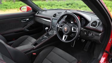
The interior of the Porsche 718 Cayman is right up there with the best cars in its class. It’s made a recognisable jump forward, and the welcome changes include a cleaner dash and infotainment design – complemented by fewer buttons and a clearer screen with high-quality graphics.
Quality is exceptional and all the materials feel solid yet soft to touch. The entry-level car comes with Alcantara sports seats but you can replace these with full-leather buckets or lightweight racing seats if you desire. Cabin storage is at a premium, but neat tricks like the folding cupholders above the glovebox are well integrated into what is an otherwise clean and minimalist design.
The dials are typical Porsche – with a large central rev counter and prominent digital speed readout sitting right in your line of sight. The right-hand dial is configurable and allows you to handily scroll through the car’s functions such as trip computer, nav display and media interface. It’s all nicely high-res, too, so it doesn’t feel like a cheap and nasty afterthought.
Of course, you can customise your Cayman until the cows come home, with a variety of special colours, materials and options to make the driving experience even more focused.
The Sport Design Package boasts sportier bumpers and trim, while you can paint everything from the door handles to the headlight cleaning system in high-gloss black, while GTS cars look more aggressive, with huge 20-inch wheels and subtle GTS badging. Dark tinted lights are standard, too.
Sat-nav, stereo and infotainment
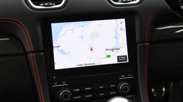
The 718 Cayman has used Porsche’s fourth-generation PCM infotainment since 2016, and as such it's an older system than is fitted to other models in the range. While it gets the basic job done, it feels a little dated. There’s no Android Auto compatibility (although Apple CarPlay is standard), but the main issue is that the display is the smallest, compounded by a relatively low resolution.
The set-up is easy enough to use, though; eight clear tiles link to the main functions, while the mapping screen has a small row of shortcuts along the bottom. Below the screen is a bank of physical shortcut keys.
The instrument panel is split into three round bezels, with a rev counter in the middle, a speedo to the left and a small digital screen to the right. This can show several different pages of information. It’s controlled by a small column-mounted stalk, which is fairly intuitive to use.
