BMW iX review - Interior, design and technology
The iX’s exterior design may put some off, but the interior quality and tech certainly have the wow factor

While BMW has built a solid reputation for its engineering expertise over the years, the manufacturer has sometimes come in for criticism over its approach to the exterior design of its cars. The controversial styling of the 5 Series and 7 Series executive saloons in the early noughties did not go down well with buyers, while the polarising ‘flame surfacing’ of the Z4 roadster attracted a lot of criticism.
The iX signifies another design leap for BMW, with the bespoke all-electric SUV featuring lots of angular lines and bluff panels. Not to mention the elongated grille that has proven controversial. The overall look will probably divide opinion, but the iX definitely stands out against the more traditionally-styled Audi Q8 e-tron and Mercedes EQC.
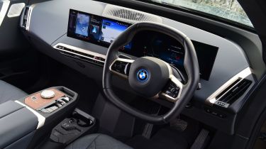
A peek inside the cabin highlights why the iX is BMW’s all-electric flagship SUV – it oozes quality, with an ultra-modern feel and lots of soft-touch, suede-like materials in use across the dash and door cards. At first glance the seats look relatively flat, but soft centre padding means they’re both comfortable and supportive, while both the driver and passengers will appreciate the full-length ‘Sky Lounge’ panoramic sunroof that floods the cabin with light when fitted.
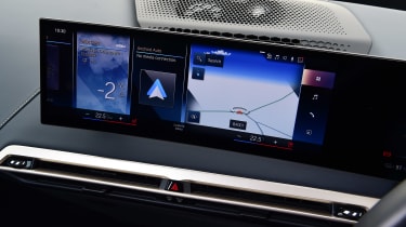
Two 14.5-inch curved screens take centre stage, while the standard Live Cockpit Professional media setup features a head-up display function and BMW’s latest iDrive system.
Sat-nav, stereo and infotainment
At a time when almost every other car maker is moving exclusively to touchscreen inputs, BMW has chosen to keep the iDrive clickwheel input for its eighth-generation infotainment system. That’s a very good thing – it was, and still is, much easier to make adjustments on the move with these physical controls.
The displays themselves look spectacular. Two vast screens sit side-by-side within a gently curved pane that appears to float above the dash. The graphics are bright and stylish, loading times are incredibly quick, and the full-screen integration of Android Auto and Apple CarPlay is one of the best we’ve seen.
One of the few criticisms we can level is down to key sizes. The main menu lists all of the functions on one screen; despite the huge screen size, the sheer number of sub-menus means that each is reduced to a small, fiddly icon. We’d prefer it if less important functions were relegated to a separate page.

