Styling
Successful design gives market’s leading small cars a personality all of their own.

Designing a tiny city car is no easy task. For example, do you target younger buyers with fashionable looks? Or do you aim to appeal to a much wider audience with a more mature shape?
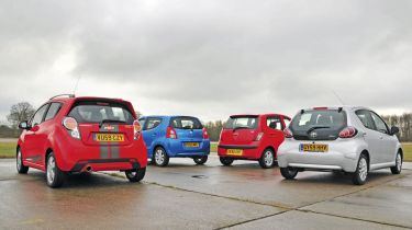
Chevrolet is clearly eyeing the youth market with the new Spark. It closely resembles the Beat concept, which made its debut at the 2007 New York Motor Show. From the front, the Spark looks genuinely sporty, with a deep bumper, chrome-trimmed foglights and an aggressive grille.
Legal requirements mean the headlamps are much larger than the car seen on the stands, though, and as a result the shape doesn’t have the concept’s sleek sparkle. Designers have clumsily tried to disguise the road car’s more practical five-door body by hiding the rear door handles, but the effect is compromised by the huge expanse of black plastic used to achieve this.
Other visual tricks include a large tailpipe, which protrudes from the rear bumper – it hides the much smaller genuine pipe. Clear tail-lights and silver roof rails help to set the Spark apart from its rivals, although the overall impression is of a car that’s trying a bit too hard to stand out. And the results are sure to divide opinion. In comparison, the Hyundai i10 is much more restrained. Next to the Chevrolet, it looks a little dated and even slightly dowdy, with small wheels that are lost against such a tall body.
But everything in this car is designed to serve a purpose, rather than pander to fashion. The tall roofline creates more headroom than in the Spark, while the large glass area gives a much better view out.
Rather than shout about its presence, the i10 uses subtle chrome finishing on the grille and tailgate, as well as neatly integrated foglights and simple rubbing strips, to reinforce its refined image. The Toyota Aygo is neither as grown-up as the Hyundai nor as trendy as the Spark. But while it’s the oldest design in our line-up, it still looks fresh and distinctive. Although its simple glass tailgate is a cost-cutting measure, it also helps to mark the stylish Toyota out from the crowd.
In range-topping Platinum trim, everything is colour coded, and a neat set of alloy wheels gives the design a classy edge. Elsewhere, the standard Aygo shape is adorned with simple detailing and neat proportions, although the car is a little bit smaller than its opponents in this test – and that has obvious consequences inside (see Page 90).
The Alto is arguably the most eye-catching model here, largely because of its bright blue paintwork. But look past the colour, and you’re met with a disappointingly staid design.
The squared-off rear bumper sits uncomfortably with the rounded body panels, while the detailing lacks the finesse of the other cars. Things improve at the front, though, with bug-eyed headlights and a gaping grille. And the Suzuki looks much more attractive than its Nissan Pixo sister model.
Results
Hyundai - 4/5
It’s the most mature car in this group – and the i10 may not appeal to younger buyers for that very reason. However, it’s a well balanced shape, and is completed by simple details. The chrome touches help to lift the overall look, and add a touch of class.
Chevrolet - 4/5
The Spark makes an impact, but it’s not subtle – especially with our model’s racing stripes. Still, it’s a faithful recreation of the concept that inspired it, and is the most modern design here. Finished in a more sober colour, it’s an attractive choice.
Toyota - 4/5
The Aygo is the oldest model on test, but there’s no doubt it remains fresh. It’s smaller than its rivals, while modern detailing gives a cheeky look. And with our Platinum variant’s alloys and striking silver paint, it’s still a classy choice.
Suzuki - 3/5
Even though it hasn’t been on sale for as long as the i10, the Alto has the most dated shape. The styling doesn’t flow as you move around the car, and the detailing is clumsy. The Suzuki’s friendly face – with those bug-eyed headlights and gaping grille – is the saving grace.


