Citroen C1 (2014-2022) review - Interior, design and technology
Chic styling inside and out hides a solid city car package; just don’t expect any surprises

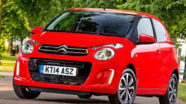
Although the latest Citroen C1 has almost identical dimensions to its predecessor – not surprising as it’s a development of the previous-generation model’s platform – the company has done a great job of making the design fun, fresh and entirely different from its Toyota and Peugeot sister cars.
The split headlight design is an interpretation of the same theme you’ll find on the Citroen C4 Cactus, while vertical LED lights are integrated neatly into the front bumper.
At the rear, square 3D-effect tail-lights and a blacked-out glass tailgate are also distinctive, while the side profile is shared with the Aygo and 108. It’s a similar story with the interior design; this is replicated across all three of the city cars, with the exception of the badges.
Colour-coded trim on the centre console and gear lever surround, as well as flashes of exterior colour on the doors and the option of striped seat upholstery, ensure the C1’s interior is light and cheery.
The driver sits in front of a single binnacle housing a large speedometer dial, while the infotainment and nav systems are located on a separate ‘floating’ binnacle in the centre of the dash. It looks good, but the cabin control layout is less intuitive from the driver’s perspective than, say, a Volkswagen up!
Push and scratch some of the surfaces and it’s instantly obvious that the quality of materials isn’t up to the standard of class leaders, although the Mk2 C1 has a better finish than before, and by no means feels bargain basement.
The little Citroen doesn’t feel like a technology fest inside, but buyers don’t expect much at this end of the new car market. Even so, there are some highlights – apart from the touchscreen and reversing camera (on Flair models), you can have keyless entry and keyless start, while all versions of the C1 feature hill-start assist.
Sat-nav, stereo and infotainment
All models except entry-level Touch come equipped with a seven-inch touchscreen designed to mirror the screen of Android smartphones. The trouble is, as promising as this sounds, the technology doesn’t feel as though it’s been fully developed yet. The operating interface isn’t seamless, and may cause some frustration to people who are used to the slick interfaces on tablets and consoles. The MirrorLink function is not compatible with all smartphones, either. The Flair and Feel models also come with Apple CarPlay and Android Auto compatibility.


