Peugeot 2008 - Interior, design and technology
The Peugeot 2008’s unique design and build quality are let down by the Marmite driving position and laggy infotainment

The latest Peugeot 2008 looks far more distinctive than the somewhat bland-looking original 2008, with a chiselled shoulder line, blocky silhouette, and distinctive front end dominated by LED lights. A facelift in 2023 has only enhanced its appearance, making it look more like a concept car that someone accidentally let out of Peugeot's vault. It incorporates Peugeot's shield logo, plus the same three-bar lighting signature that also features on the facelifted Peugeot 208 supermini, with the vertical LEDs integrated into gloss-black inserts in the front bumper.
All versions feature a vertical grille pattern in the same colour as the car's bodywork. The 2008’s three-claw LED tail-lights have also been tweaked. There’s no denying the 2008 is an eye-catching car, which helps it stand out in the bloated small SUV segment, and we’re sure has allowed it to be sold on looks alone a good many times.
What is the Peugeot 2008 like inside?
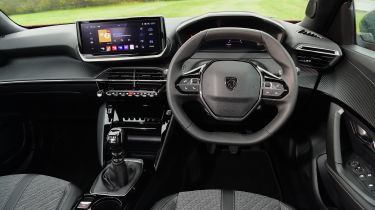
Inside, the 2008’s interior design, although a little quirky and very gloomy in our opinion, offers superb levels of quality for the class and puts most of its rivals, like the Ford Puma, in the shade. Sadly, there aren’t any physical climate controls, so if you want to change the temperature or adjust the fan speed, you’ll have to delve into the central touchscreen. The piano-style keys below the screen only cover limited functions or controls that have to have a physical button by law, such as the hazard warning lights.
More reviews
Car group tests
In-depth reviews
Long-term tests
Road tests
- New Peugeot 2008 facelift 2024 review: petrol power suits the updated small SUV
- New Peugeot E-2008 2023 facelift review
- New Peugeot e-2008 2022 review
Used car tests
Other highlights include Peugeot’s i-Cockpit layout, although you’ll need an Allure and above to get it with the configurable digital dash display. The digital display is similar to Audi’s Virtual Cockpit in that you can change the layout from traditional dials to displaying various trip or driving assistance screens, or – as we’ve found particularly useful – show sat-nav directions on a map. Switching between screens isn’t as easy as in an Audi, and there’s no full map-view option, either.
However, some individuals might find it hard to see the dials, as Peugeot’s i-Cockpit setup also includes a small flat-bottomed steering wheel that you should look over to read the instruments rather than through it. When we tested the 2008, it took us a long time to find a natural-feeling driving position that didn’t involve having the steering wheel basically in our lap, but even then, we couldn’t see the dials fully. The setup won’t suit all, so we’d recommend trying a 2008 first before buying.
What is the interior quality like?
While the striking design and layout of the 2008 interior is what hits you first, once you’re settled you’ll start to notice that many of the areas you frequently come in contact with have a premium feel to them, putting some distance between this Peugeot and the rather disappointing insides of the Ford Puma and Volkswagen T-Cross. You will still find some cheaper plastics used, but these are in less obvious places, such as the lower door cards and glovebox lid.
Sat-nav, stereo and infotainment
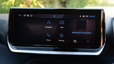
Every 2008 now features a 10-inch central touchscreen display with Bluetooth, a DAB radio, plus wireless Android Auto and Apple CarPlay smartphone connectivity to run your own audio and navigation apps. In-built sat-nav is an option for all versions.
You’ll need to upgrade to Allure or GT trim to get a screen with high-definition graphics, and the upgraded screen is more visually appealing, the operating system itself is very laggy, often using swipe transitions to cover up the thinking time the car needs when you tap to enter a menu. Ultimately, it’s nowhere near as slick as the setups in rivals such as the Hyundai Kona.
Top-of-the-range GT variants also feature a 3D version of the i-Cockpit digital driver display, which looks very modern, but It’s more of a gimmick than a genuinely useful feature. A wireless smartphone charging pad is available as an option on mid-range Allure trim, and comes as standard on GT.


