Ferrari California T (2014-2018) review - Interior, design and technology
The California T is much better looking than its predecessor – and now you can connect your phone!

One of the difficulties with folding metal hard-tops is to create a sleek design with the roof up or down, but the Ferrari California has achieved just that. The first California (of this new generation) was not considered a looker in all quarters, but the swoopy exterior design was updated when the California T arrived, with every panel modified apart from the roof.
The new sleeker styling certainly turns heads, and is widely thought of as a successful upgrade. Nice touches include the stacked exhaust pipes and circular rear lights, which hark back to classic Ferrari models. The front end now also shares closer family design cues with the more exotic Ferrari F12.
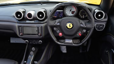
The interior manages to combine technology and old-school luxury at the same time, and you get lashings of leather upholstery and a dash that’s more tactile and comfortably finished than some of Ferrari’s more hard-core sporting models.
It all feels impressively bespoke, but the California’s interior doesn’t have the rock-solid indestructible feel of a high-end Mercedes. And although the interior design is undoubtedly attractive and luxurious, it doesn’t have the cohesive design feel of some rivals either. Interior and dashboard design elements feel slightly ‘thrown together’, without the rigour and consistency you’d expect from a German luxury model.
Sat-nav, stereo and infotainment
Apple CarPlay is now on the Ferrari California’s agenda, which is a very welcome update for the typically well-connected owner of such a car. The system still doesn’t match up to the usability standards of top-notch mainstream providers, but Ferrari has never pushed the boundaries there anyway. Audiophiles (with deep pockets) will love the optional JBL Professional sound system, which comes with a dozen speakers and 1,280 Watts of output.


