Ford Capri - Interior, design & technology
It may be identical to the Explorer inside, but Ford’s take on the modern EV is stylish and well-thought-out

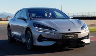
Ford will be betting on the Capri’s style to be a big draw card for potential customers, and in that respect, it definitely stands out. Especially in its brighter hues, the Capri looks contemporary without getting anywhere near retro. Rather than nostalgia, its design takes certain elements associated with the original and reimagines them on a much more modern canvas.
The black bar between the headlights and dipped centre section is directly inspired by the ‘70s original, and so too are the double running light elements, but neither leads to a design that looks overtly retro. The same can be said of the C-shaped windows, and despite being placed over a much larger body, everything is well-proportioned and looks distinctive.
What is the Ford Capri like inside?
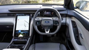
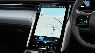
The interior shows absolutely no sign of any retro-connection, being a wholesale carryover from the Explorer. This is no bad thing, though, as the dashboard’s massive 14.6-inch infotainment display is relatively easy to use and offers plenty of space for the built-in navigation system. The climate functions are embedded in the screen, but key controls reside on the bottom edge, making quick adjustments easy to perform.
What is the interior quality like?
Interior quality is good, with solid, mostly soft-touch plastics used throughout the cabin. Some elements, such as the indicator stalks and drive selector are clearly carried over from VW, but by and large, the quality is actually better.
Used - available now

2025 Ford
Capri
AutomaticElectric
Cash £54,700This is due to a couple of reasons. Firstly, there’s very little, if any, fakery on show. Unlike many modern car firms, there are no faux or pointless seams of stitching across the dash, and what is plastic looks like plastic – there’s nothing wrong with that.
Ironically, the seating material on both models is a synthetic leather with lots of stitching, but it does a very good job of feeling hard-wearing yet plush.
Sat-nav, stereo and infotainment
The main character of the tech story is Ford’s portrait-aspect touchscreen. It runs a bespoke Ford Sync software package, and is completely different to anything you’ll find in a VW – for better and worse. The system feels quick to respond, and with some acclimatisation and personalisation, you can easily navigate through the system without any trouble. You had better like blue, though, as both the daytime and nighttime interfaces use the hue on all main menus and functions.
Apple CarPlay and Android Auto are standard fit and wireless. There’s a wireless phone charger in the centre console, and while it is in a good position, we found it often faulted or didn’t charge efficiently, even on a modern iPhone.
Finally, the dash-top B&O soundbar is a clever addition, looking something like the top of Singapore’s Marina Bay Sands building. Not only does it add an interesting design element, but its fabric covering and in-built lighting add some welcome texture to the largely minimalist interior design.
The small driver’s display is taken from its VW counterparts, but shows all the key info without too much clutter or complexity. With such a large centre screen, there’s plenty of space to have navigation, media and climate functions all on one display, keeping the view forward clean.
A worthy mention is also the excellent optional head-up display that’s part of an optional Driver Assistance Package, which bundles in a 360-degree camera and a few other active driver assist elements.

