Ford Mustang Mach-E - Interior, design and technology
Ford has created an all-electric family SUV with plenty of style, tech and impressive levels of standard kit

It’s all subjective, but Ford seems to have pulled off a cool, funky design for the Mustang Mach-E - trading on its iconic sports car’s name and style elements, without falling into the trap of looking cheap or tacky.
In the quest to appear more upmarket, Ford has chosen not to include its blue oval badge on the Mach-E, and instead it features the running pony logo of its muscle car stablemate - it is a Mustang after all. There are also some quirky design details, such as the exterior door handles being replaced by a small button that opens the door when you touch it.
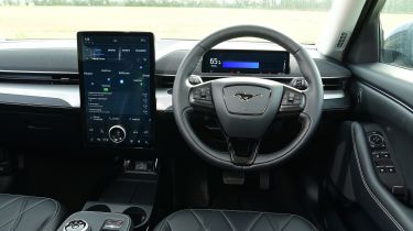
Inside the cabin, the Mustang Mach-E feels a little more premium than other Ford models, although there are some carry-over parts that you might recognise such as the gear selector and indicator stalk.
Opting for the entry-level RWD Standard Range car certainly won’t leave you feeling short-changed, as standard kit includes dual-zone climate control, a rear view camera, heated front seats and a heated steering wheel, not to mention a modern 15.5-inch touchscreen and 10.2-inch digital instrument display.
Further up the Mach-E price list, the Extended Range models add a touch of luxury with upgraded upholstery, electrically-adjustable front seats, a powered tailgate, a ten-speaker Bang & Olufsen audio system and a glass panoramic roof.
Sat-nav, stereo and infotainment
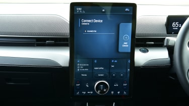
Ford’s radical thinking with the Mach-E extends to the car’s infotainment system. The next-generation Ford Sync set-up comprises a 10.2-inch digital driver’s display and a central 15.5-inch touchscreen on the dash.
The system is very easy to navigate, has sharp graphics and a home screen that can be configured to show functions that you use regularly. Wireless Apple CarPlay and Android Auto also feature as standard, should you want to bypass Ford’s own interface.
The system is entirely touchscreen, and while on the whole it responds quickly, some of the sub-menus can be a little slow to load. However, there’s a digital readout directly in front of the driver which is useful.
Having the 15.5-inch screen angled slightly towards the driver would also make it easier to use, because the display sits very flush and almost vertical on the dash, meaning functions at the bottom of the screen can be a little tricky to see and operate.
