Hyundai i30 review - Interior, design and technology
Despite a few quality issues inside, the i30 feels well built and nicely designed. The clear infotainment screen is a boon, too

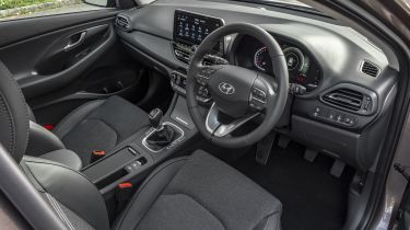
The Hyundai i30 has been designed, developed and tested in Europe, specifically for European buyers. While that clearly affects the way the car handles on broken and uneven UK roads, it also has a bearing on how owners interact with the simple and well laid-out interior.
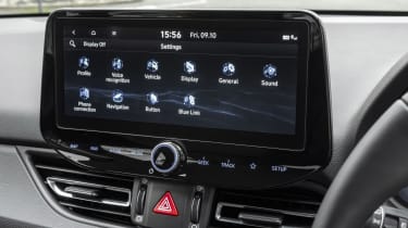
All models come with a touchscreen now that the base S spec is no longer available (it only had a dated-looking radio screen). The touchscreen measures eight inches on SE Connect, and 10.25 inches elsewhere. Both versions get Apple CarPlay and Android Auto, while the top version also gets Hyundai’s inbuilt sat nav system. The car feels solidly put together, though some scratchy plastics do let down what is an otherwise considered interior design.
On the outside, this new i30 represents the brand’s new design language with a fresh cascading grille and bold LED headlights. It’s not as arresting as a Renault Megane, or even as striking as the SEAT Leon, but it’s easily a match for nondescript rivals like the Volkswagen Golf or Ford Focus. Neat LED tail-lights give the car a distinctive signature at night.
Sat-nav, stereo and infotainment
There are plenty of tech options available on Hyundai’s latest i30, including all the latest connectivity boons. Lots of safety kit is included as standard, while things like Rear Cross Traffic Alert is available on top-spec cars.
The touchscreen system is clear and quick to respond, despite dated-looking graphics, while the live services, such as traffic, weather and speed camera alerts, make life on the road easier. A seven-year free subscription to Hyundai’s Live Services comes as standard, while wireless phone charging is also included on SE Nav.
We found it easy to pair our phone and use the connectivity apps available, while the decent screen also means the reversing camera gives a nicely detailed image, which makes manoeuvring easier. Hot keys mounted at the bottom of the screen also make it relatively simple to jump to certain areas of the system. Moving the buttons from the sides of the screen has also modernised the interior a little.


