Kia e-Niro (2017-2022) review - Interior, design and technology
It’s not exciting to look at but the e-Niro is well built, sensibly designed and includes good on-board tech

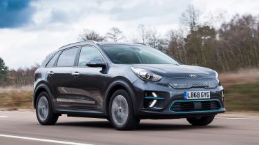
To the untrained eye the Kia e-Niro looks more or less exactly like its hybrid siblings – only a few detail changes like a closed-in grille, blue accents on the bumpers and slightly different LED daytime running lights set it apart.
It’s a similar story Inside, where the very familiar cabin has a finish that’s better described as functional rather than luxurious; a large rotary drive select dial on the centre console is the biggest change versus other Niro models. The Kia Niro range was always meant to include an EV so its platform is devoid of some of the packaging drawbacks encountered in some of its rivals. There’s loads of interior space and the e-Niro is a very comfortable car to travel in as a result.
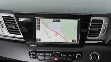
There’s useful tech fitted, including a linked-up navigation system that analyses the route and can tell you when to take your foot off the throttle pedal to maximise the range.
Those looking to put their stamp on their e-Niro will be disappointed – a limited range of colours and a few accessories are all that appears on the options list. The Kia comes very well equipped as standard, but those looking to express their individuality will be better served by the chic BMW i3.
Sat-nav, stereo and infotainment
The e-Niro’s infotainment is much like that in other higher-spec Kias, which means it’s good. The entry-level 2 trim features an eight-inch touchscreen which responds fairly quickly to inputs, although the screen resolution could be a little sharper. Customers opting for the 3 and 4+ equipment levels benefit from an upgraded 10.25-inch display.
Yet it’s the overall functionality included as standard that should be praised. Sat-nav, wireless phone charging, Android Auto and Apple CarPlay all feature, as do DAB radio, Bluetooth, a reversing camera and Kia’s connected services (powered by TomTom to show live traffic and other info). On the e-Niro it’ll also show charging points near your car, along your route or at your destination.
The layout is fairly logical and easy to navigate, while the screen is well placed. There are still a few foibles –there’s one process too many for something simple, such as entering a destination into the sat-nav, and no full digital dash. But that is coming on updated Niro models.
The e-Niro gets a couple of EV-specific menus, including an Energy Consumption page, which shows how much energy has been used by driving, as well as consumption by the lights and climate control. Another page shows predicted range and charging times.
