Polestar 3 - Interior, design & technology
The fantastic-looking interior of the Polestar 3 is let down by some irritating ergonomic quirks

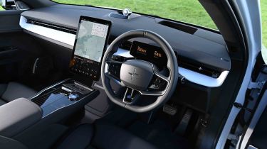
The cabin of the Polestar 3 looks and feels great, but the user interface does throw up some ergonomic irritations that wouldn’t be present with physical buttons.
What is the Polestar 3 like inside?
The minimalist dashboard design is interrupted only by a vast central touchscreen that controls nearly all of the car’s main functions. While we don’t mind things such as the door mirrors being accessed via the screen, consigning the headlights to it is less excusable when they’re something that’s used nearly every time you drive. Not only that, but during our time with a Polestar 3, we found the headlight flasher didn’t respond well – and sometimes not at all – to the column stalk.
What is the interior quality like?
The Polestar 3 is up against some finely built competition, such as the BMW iX and the Audi Q6 e-tron, but it can match them for fit and finish. It feels expensive, and things are helped by wonderfully comfortable front seats.
Sat-nav, stereo and infotainment
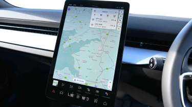
There is little room on the dashboard for physical buttons when a 14.5-inch portrait touchscreen occupies most of the space. We’d prefer the climate controls to be separate from the main display, which would allow more room for the best bits of the Android Automotive operating system, such as the fantastic Google-based navigation system.
We did find it curious that it was possible to use the on-screen keyboard to enter an address on the move, though – we can’t see how this is any safer than using your own smartphone. Considering Polestar’s close ties with Volvo and its strong safety record, we expected to find the keypad locked out when driving.


