Renault Scenic review (2016-2019) - Interior, design and technology
The Scenic's bold exterior gives it the edge over staid MPVs, while the interior is versatile and well-made

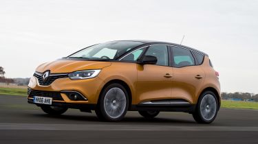
Renault’s design boss Laurens van den Acker has gone to great lengths to explain why the exterior look of the Scenic is so important. The only way to save the MPV sector is to make these cars more desirable, he reckons, and he’s even gone as far as saying that if this Scenic doesn’t sell, then MPVs deserve to die altogether.
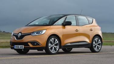
You can see what he’s getting at when you first clap eyes on the Scenic. The bulbous front-end is even more striking than the Renault Kadjar, while the windscreen is steeply raked and there are loads of curves and creases.
At the back the design is softer and more rounded, while it’s raised up slightly to give it presence. You could go as far as calling it elegant, although this is still an MPV. It certainly gives the Citroen C4 SpaceTourer a run for its money, and is far less staid than many other MPV rivals.
The 20-inch wheels are as big a design trait as the bodywork – they’re the same size as the ones you get on a Bentley Mulsanne, for example. There are several designs available, and they can even be personalised with handy inserts that clip on and off.
Used - available now

2023 Land Rover
Range Rover Evoque
16,327 milesAutomaticDiesel2.0L
Cash £24,920
2022 Peugeot
5008
3,424 milesAutomaticPetrol1.2L
Cash £26,199
2025 Volkswagen
Touran
16,670 milesAutomaticPetrol1.5L
Cash £22,513
2023 Vauxhall
Corsa
25,107 milesAutomaticPetrol1.2L
Cash £15,540Inside, things aren’t quite as stylish. Most of the plastics are dark and the design isn’t particularly interesting. Still, it looks smart enough and feels considerably better built than the previous generation car, with only a few squeaks and rattles on our early test model letting things down. It just lacks a bit of the plushness and airiness of the C4 SpaceTourer's interior.
The design is much the same as its Megane sistrr model, only with a less driver focused and more upright, family-friendly shape. Renault has elected to ditch the old centrally-mounted speedo and use digital instruments in the conventional place behind the wheel, which it says improves the driver’s control of the car. Top models are very well kitted-out, thanks to electric memory leather seats, a panoramic glass roof, a Bose sound system and a head-up display, plus the new portrait-style touchscreen.
Sat-nav, stereo and infotainment
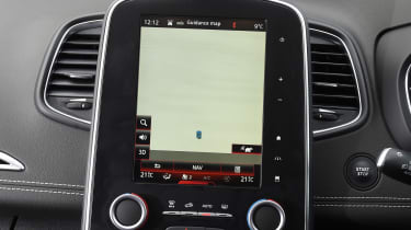
Play and Iconic versions of the Scenic feature a 7-inch infotainment touchscreen as standard, but Signature models get the portrait-style 8.7-inch R-Link 2 set-up first seen in the Megane. Compared with the units in the Citroen and Ford, the Renault has the crispest graphics, the most user-friendly menus and most responsive screen, which includes a pinch and swipe function.
As with its rivals, the screen features a number of tabs that work as shortcuts to the main functions (sat-nav, stereo and climate controls). Connecting your phone is straightforward, as is programming a destination into the nav, although we found the TomTom-powered unit often failed to highlight snarl-ups until we were in them.
All versions of the R-Link 2 system feature a 12-month subscription to the R-Link store, for access to a variety of free and paid for apps, from weather updates and Michelin guides to a concierge service and E-mail. One criticism is that there’s no Apple CarPlay or Android Auto option.
The system is fairly easy to operate, although it can be slow to swap between menus, which spoils the experience somewhat.

