Skoda Rapid review - Interior, design and technology
The Skoda Rapid's conservative exterior wraps an unexciting cabin with no 'surprise and delight' features

Styling often takes a back seat in the pursuit of versatility and that's definitely the case with the Skoda Rapid.
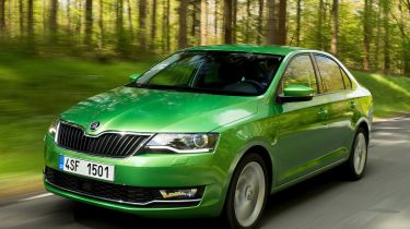
As with the larger Octavia, the Rapid’s rear end shape comes from its big boot, but unlike a conventional hatchback, the Rapid’s tailgate slopes more gently down to the base of its C-pillars. Despite this bigger hatch opening and long look of the bodywork, the Rapid is actually shorter than most rival hatchbacks, although the Skoda’s overall shape and styling mean this difference isn’t as noticeable when they’re parked side-by-side.
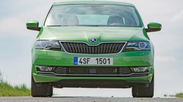
The Rapid conforms to Skoda’s relatively conventional, reserved design, so there aren’t many flourishes to speak of. There are lots of geometric shapes at the front and the Rapid’s main grille and headlights, and lower grille and foglamps, create two strong, wide elements in the front bumper.
Apart from a depression at the bottom of the doors, the crease that connects the headlights to the tail-lamps down the car’s flanks is the Rapid’s only notable detail in profile, while at the rear the C-shaped tail-lights and creases on the bootlid give a little bit more visual interest to what’s an otherwise plain and simple shape.
Although the Rapid pre-dates the firm’s flagship Superb model, Skoda’s value-focused hatchback features a few styling cues similar to the larger, more expensive car inside. The dash top doesn’t drop away towards the sides of the car, remaining almost the same level across the width of the cabin. This accentuates the sense of width and space.
The drawback is that it feels like there’s a lot of low-rent plastic in prominent areas. However, the slabby centre console constructed of unforgiving material still highlights the Rapid’s budget price.
Sat-nav, stereo and infotainment
The Skoda Rapid has a reasonable infotainemnt system. The 6.5-inch screen looks small in the dashboard, and makes pressing the multitude of buttons to control the sat-nav fiddly, since each icon has to be so small to fit on to the display. At least the graphics are clear, bright and easy to understand, and the sat-nav does comes with live traffic updates. There’s even a button at the side of the screen that shows you any traffic jams in your immediate area.
The buttons along the sides of the display make navigating between different screens easy, and the interface is user-friendly, apart from the small size of the buttons. If you add the SmartLink option (which costs around £150), you can use your smartphone with the screen, enabling Android Auto and Apple CarPlay. You can get extra USB ports in the back with the optional multi-device interface, which costs about £120.


