Skoda Yeti (2009-2017) review - Interior, design and technology
The Yeti has some dated components, but comfort and quality are excellent

A reputation for putting function over form hasn’t stopped Skoda from cutting a dash in the crossover class with the Yeti.
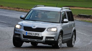
Rather than go for a soft, rounded look like the Qashqai, the Yeti has raided the off-roader wardrobe and adopted full-on 4x4 styling. For the latest model, there’s a new nose featuring a wider grille with distinctive bonnet peak. The lights are reminiscent of the Octavia hatchback’s, but the rest of the car remains largely the same as the original Yeti.
The upright body, tall roof, chunky roof rails and vertical tailgate mean the Skoda stands taller and looks boxier than its rivals. As a result, it stands out from the crowd.
Since its most recent update, the Yeti has been offered in two distinct model lines. The standard Yeti comes with body-coloured lower bumpers and sills, while the Yeti Outdoor version gets traditional black plastic cladding and front and rear bumpers that have been optimised to give the best departure and approach angles when off-roading.
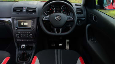
Inside, there's a relatively plain, but still attractive, fascia made of rugged, yet still soft-touch, materials. Like the Skoda brand itself, the Yeti is all about form following function. There’s little in the way of fripperies, but the ergonomics are generally excellent, the driving position high-set but comfy and the overall sense of quality is really very good. Higher-spec Yetis can actually feel quite plush, in fact.
On the outside, while the black-roofed Monte Carlo editions look pleasingly mean, we’d avoid the white-roof option (it looks a touch silly) and there are some seventies-style beiges and browns that are probably best left in the catalogue and away from the road.
Sat-nav, stereo and infotainment
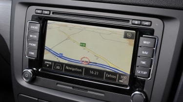
The only flaw in the Yeti’s interior is that it’s soldiering on with the older-tech Volkswagen Group sat-nav and infotainment. OK, so that’s the definition of a first-world problem but it’s certainly less slick and overall less capable than the newer systems seen in the likes of the Fabia, Octavia and new Superb.
The Yeti’s touchscreen system is simple enough to use and it works just fine, but there’s none of the slick menu controls and expensive-looking graphics that you get with the latest Skoda models. A five-inch touchscreen, with Bluetooth, is standard while more expensive models get a larger 6.5-inch screen and DAB. The basic system comes with a slot for an SD memory card, a USB port, an aux-in socket and two 12v power sockets: one in the dash, one in the boot.

