Tesla Model Y - Interior, design and technology
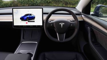
A large touchscreen is the focal point of the Tesla Model Y’s otherwise minimalist cabin

To all intents and purposes, the Tesla Model Y is the high-riding SUV version of the Tesla Model 3 saloon, as both use the same basic architecture and bar of soap-like styling. The most noticeable differences between the two are the Model Y’s increased ride height, taller roof line, a little extra bodywork, and black plastic trim around the door sills and wheel arches.
It’s the same story inside, with the Model Y borrowing its little brother’s 15.4-inch central touchscreen that takes pride of place in the smart but spartan cabin, where the only physical controls you’ll find are on the multi-function steering wheel, the column stalks and the electric window and door opening buttons. It's a modern-looking cabin, but in some cases, its minimalism comes at the expense of sound ergonomics.
What is the Tesla Model Y like inside?
Sink into some soft, comfortable seats, and the Model Y presents the driver with a minimalist dashboard. Only a large touchscreen breaks up the vast span of wood-effect trim that crosses the dashboard and runs into the door panels, while air is vented through a subtle gap just above it.
What is the interior quality like?
Build quality has long been a bone of contention for Teslas we’ve tested, with early models suffering from sharp plastic trim pieces inside and uneven panel gaps on the outside. Our latest Model Y test cars show that things have certainly improved; while we wouldn’t rate the level of finish as highly as what you’d find on a BMW or Peugeot – the latter now the standard setter among mainstream brands – it appeared to be fine.
Sat-nav, stereo and infotainment
Tesla considers itself a tech company as much as a car brand, and in many areas this is clear to see – for better and for worse. There are no dials ahead of the small-diameter steering wheel; instead everything is controlled through the vast central touchscreen.
More reviews
Some of this is quite neatly worked out, with controls that most people will only adjust a handful of times (such as the steering wheel and door mirrors) tweaked by the neat thumb wheels on the steering wheel spokes.
Others are just a bit irritating. Headlights and wipers should always be easily accessible, and while a quick prod on the end of the indicator stalk makes the wipers move and brings up an on-screen sub menu to adjust the speed, playing with the lights on the display is far more of a faff than it would be with a simple switch.
The glovebox is only accessible through the screen, too, so if your passenger wants to open it on the move, then they will have to dive into a sub-menu, taking the screen away from the navigation page the driver was likely using.
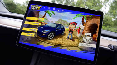
When it comes to loading times, screen responsiveness and graphics, the Model Y has one of the very best infotainment systems of any new car. The navigation system is rapid and can automatically plot a route based on any charges that are needed along the way; it’ll even tell you how many minutes a stop will require and add that to the total journey time. As with all Teslas, Apple CarPlay and Android Auto are not available, but you don’t miss them because Tesla’s system is so good.
