Toyota Auris Hybrid (2012-2018) review - Interior, design and technology
In spite of its contemporary engine set-up, the Auris Hybrid can’t offer drivers a truly premium feel

The overall shape of the Toyota Auris Hybrid is a typical compact hatch, but it’s been enhanced with distinctive styling front and rear. It shares its looks with the Verso MPV, with a pointed nose, angular headlights and a large grille below the front bumper, while at the rear are sharp LED tail-lamps.
On top of this, Hybrid models get their own unique touches in the form of blue highlights on the Toyota badges front and rear, and HSD badges on the front wings and tailgate.
The Excel model comes with 17-inch wheels, while Icon trim gets smaller 15-inch rims with skinny tyres that help to keep emissions low.
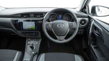
Inside, the Auris is a disappointment compared to many of its rivals – particularly if you have a fondness for Germanic order. The design is a bit messy, with the mix of rectangular air vents on the centre console and ball-type vents at either end of the dash being a good example of where the feel is less cohesive and premium than – say – VW Group cars.
Even more fussy are the climate controls, while the dated digital clock is set apart from the other displays, far to the left of the driver.
That said, it’s fair to add that the Auris interior seems generally well built. Plastics aren’t up to the quality of the Volkswagen Golf, but they’re better than you’d expect to find in a Kia or Hyundai.
Sat-nav, stereo and infotainment
All versions except the entry-level Auris Active come with a seven-inch touchscreen infotainment centre. Toyota’s touchscreen system is clear and easy to use, while the central display between the dials is almost on par with the Golf GTE’s similar digital read-out.
While the Auris Icon trim level comes with the touchscreen, a rear-view parking camera and Bluetooth phone connectivity, you need to opt for the Business Edition or Design trim to have sat-nav thrown in.


