Toyota Camry (2019-2022) - Interior, design and technology
The Camry looks smart and is well built, but poor infotainment lets it down

Just so you know, this is an older review of the 2019-2022 Toyota Camry. If you are interested in news about the latest Toyota models, please follow the link provided.
The Camry’s design doesn’t exactly scream kerb appeal, but it’s modern and handsome. Fit and finish is great throughout, while the functional and practical cabin only just trails rivals for outright quality.
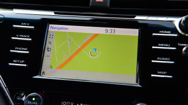
The dashboard itself is clear and logically laid-out for the most part, but the central infotainment screen is a big letdown. Overall equipment levels are good, but Camry doesn’t feel especially upmarket inside. It’s a shame that Toyota hasn’t managed to inject a little verve – step from the Camry into a Peugeot 508, for example, and the contrast in design and overall appeal is stark.
The 2021 facelift introduced a choice of three new instrument panel finishes in either wood-effect, titanium-effect and a geometric-patterned plastic shroud. Buyers get a choice of beige or black perforated leather upholstery.
Sat-nav, stereo and infotainment
The infotainment system was Toyota’s Achilles’ heel and customer feedback proves as much. Things are improving with its latest generation of vehicles, and the Camry shows where these gains have been made, thanks to the sharper graphics on its seven-inch touchscreen.
The introduction of a new nine-inch touchscreen infotainment system for the 2021 Camry is another step in the right direction. Crucially, it includes support for Apple CarPlay and Android Auto, answering one of our criticisms of the pre-facelift Camry.


