Toyota Corolla review - Interior, design and technology
The Corolla looks the part and is well made, plus the new infotainment is a definite improvement over the old setup

The Corolla might have a soft, rather rounded silhouette, but at the front Toyota has given its family hatchback a distinctive, sharp facia that takes cues from the larger Toyota Camry saloon and Mk1 C-HR SUV, and was left mostly untouched by the Corolla’s recent mid-life facelift. It did receive some tweaks to the headlight units and the front bumper, so it’s still as handsome as ever.
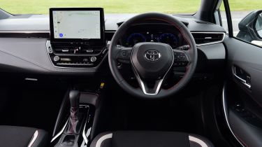
Inside, the Corolla boasts a similarly modern design that’s clearly laid out and generally felt very well made, with solid build quality and some soft-touch materials scattered about. It’s not luxurious, but the cabin quality certainly eclipses the harsher, plasticky-feeling interior of the current VW Golf. We also like that Toyota has stuck with physical buttons for the climate controls, and made some much needed improvements to the infotainment system with the addition of a new 10.5-inch touchscreen and fully digital dash.
As well as the choice of a hatchback or Touring Sports estate, plus the two engine sizes, buyers can pick one of four trim levels – Icon, Design, GR Sport and Excel – with prices starting from over £30,000. Standard kit includes the 10.5-inch touchscreen, built-in sat-nav, over-the-air update capability, smartphone connectivity, dual-zone climate control, alloy wheels, LED headlights, a reversing camera, Toyota’s Safety Sense tech and wireless smartphone charging.
More reviews
Car group tests
In-depth reviews
Long-term tests
- Toyota Corolla GR Sport long-term test: a high-quality but slightly cramped hybrid
- Toyota Corolla Commercial: long-term test review
Road tests
Used car tests
There are various alloy wheel designs across the range, from 16- to 18-inches. Other styling choices include black, red and chrome trim packs. Solid ‘Pure White’ is standard, while a range of metallic and pearlescent paints are available for around £600 to £900. Top-spec Excel models get the option of a two-tone paint job for roughly £900 or £1,200.
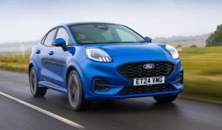
For those wondering, the GR Sport version isn’t the same as the full-fat GR Corolla sold in North America, think of it as an equivalent to Ford’s ST-Line trim. The GR Sport gets a different front bumper, a wide mesh patterned grille, black 18-inch alloy wheels with machined-edge tips to the spokes and red-edged centre caps and black surrounds for Toyota badges front and rear.
Sat-nav, stereo and infotainment
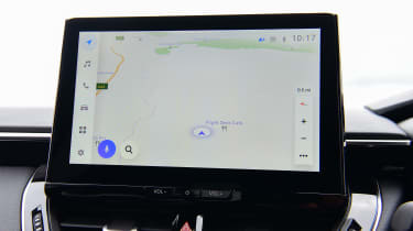
Thanks to a facelift in 2023, the Corolla now features the information system from the Toyota bZ4X electric SUV running on a 10.5-inch central touchscreen, up from the eight-inch display fitted at launch. The new setup is more responsive, offers better resolution and the menus are much simpler to navigate, so it’s a definite improvement over the old system.
Despite the significant steps forward, many people will still prefer to use Apple CarPlay or Android Auto, which work as well as you’d expect and come as standard on all models. You also get sat-nav, DAB radio, Bluetooth and voice activation, not to mention a new 12.3-inch digital dash that can be configured with four different settings.
Bar the sportier GR-inspired layout, they don’t change the feel too much, but it’s a big improvement over with the previous part-digital instrument panel. The buttons on the steering wheel are unchanged, but because there’s now more scope for changing displays, they’re not quite up to the job, so making adjustments is fiddly.
If you decide to go down the secondhand route and get a pre-facelift 12th-generation Corolla, the eight-inch touchscreen runs the Toyota Touch 2 with Go infotainment system. The display itself matches the contemporary VW Golf’s unit for size, but sadly the infotainment system itself is one of the weakest in this class. The graphics look old-fashioned and it misses out on functionality present in its rivals’ setups.
The screen and interface aren’t as responsive to the touch as the setup in a Golf, but on par with the Peugeot 308’s, while the Corolla’s old menu layout could be more logical and intuitive to speed up simple tasks. Similarly, the digital dash was less configurable than you’ll find on a Volkswagen Golf’s optional Active Info Display, and doesn’t look as modern, either.

