Toyota RAV4 (2013-2018) review - Interior, design and technology
Recent update has improved things, but the modern RAV4 doesn't stand out

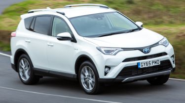
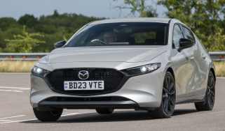
A recent update to the Toyota RAV4 meant the front of the car is better looking than before, but overall the design is sadly rather plain - the Mazda CX-5 and Renault Kadjar prove that cars in this class can look good, and the RAV4 falls far behind them.
The facelift got rid of the previous car's 'nostrils' and moved the grille upwards, integrating new headlights and a larger badge. It's smart, and gives the car a more modern look at the front. The rear wasn't changed much at all, and now looks outdated next to the refreshed nose.
The RAV4's mix of creases and curves lacks the cohesion of rivals like the Ford Kuga, particularly at the bluff rear end. One bonus is the top-hinged tailgate, with Toyota scrapping the old side-hinged setup that made the RAV4 hard to use in tight car parks. As a result, the latest-gen car is much better in this respect.
The interior quality has been improved recently as well, and while the RAV's cabin lacks charm it does feel well built. Standard kit includes a touchscreen display, DAB radio, a reversing camera, cruise control, 17-inch alloy wheels, air-conditioning and tinted windows. Higher trim levels get sat-nav, auto lights and wipers, a powered tailgate, leather seats and a full set of parking sensors.
Sat-nav, stereo and infotainment
The sat-nav – which is standard on all but the entry-level Icon model – looks a bit dated, with chunky graphics and a low-resolution screen meaning rival systems are easier to use. There are few buttons, which clears up the dashboard, but the awkward touchscreen controls can get frustrating. The nav does give clear, concise directions, however.
Smartphone connectivity will be a boon for some drivers, and the display screen comes as standard. There's even a Google Street View function on certain models.


