Toyota Yaris - Interior, design and technology
The Toyota Yaris features striking good looks and a decent level of standard equipment, although the bleak interior doesn’t inspire

Toyota has bestowed the Yaris with a strong, distinctive look. The muscular wheel arches, large grille, and sharp creases all contribute to a more purposeful stance than on the previous model, and an appearance that translates well to the beefed-up Toyota GR Yaris performance model.
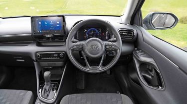
Inside the cabin, it’s a different matter. The interior design is typically Toyota – solid and practical but with very little sparkle or sense of style. The fascia is enveloped in gloomy, black plastic, with just a few metal-effect accents on show to improve the mood.
On the plus side, a good level of standard equipment is on offer. The entry-level Icon trim includes 16-inch alloy wheels, automatic headlights and wipers, adaptive cruise control, air conditioning, a reversing camera and a multi-function leather-trimmed steering wheel. It does have ‘keep fit’ manual rear windows in the back, so those with small children may want to go further up the range to get a model with electric rear windows you can lock to prevent them from being opened.
Stepping up to the Design versions adds bigger 17-inch wheels, rear privacy glass, electric rear windows, and LED headlights. If you fancy a sportier look and can’t get your hands on the GR Yaris, the GR Sports features sporty styling touches inside and out (including 18-inch black alloys), sports suspension, and keyless entry. The top-of-the-range Excel includes power folding mirrors, front and rear parking sensors, dual-zone climate control, and extra safety kit.
Sat-nav, stereo and infotainment
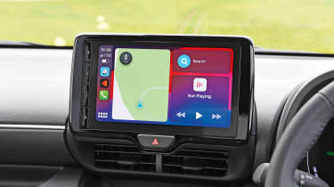
A 9.0-inch Toyota Touch 3 infotainment system, comes as standard on entry-level Icon and mid-range Design, while Excel and GR Sport feature a 10.25-inch display with sat-nav included.
Both touchscreens are positioned high on the dashboard. The smaller screen features some physical buttons on the far side of the screen, which is a little disappointing for a right-hand drive car. The larger screen has a volume dial in the middle below the screen, which is a much more sensible set up. Toyota’s infotainment menu system isn’t quite as clear as we'd like, and there are a few too many sub-menus to navigate through if you want to change a setting – radio station selection is especially frustrating if you haven’t set-up your favourites for instant access.
Apple CarPlay and Android Auto smartphone connectivity is fitted as standard, so you can bypass Toyota’s system completely if you want.


