Volvo XC40 - Interior, design and technology
A clean, uncluttered design incorporates some useful practical touches, but the layout is showing its age a little

The Volvo XC40 was revealed in 2017, but even today it still stands out as a smart-looking compact SUV when compared with its rivals. Volvo deliberately penned it to have a different look when compared with the larger Volvo XC60 and Volvo XC90 models, too, and there are some impressive design touches inside and out.
According to the car’s designer, Ian Kettle, small robots from science-fiction movies inspired the XC40’s styling, and there are lots of simple, clean lines – and as a result it looks chunky and cute at the same time. As with other models in the line-up, there’s a variation on the familiar ‘Thor’s Hammer’ daytime running light signature up front, while the tail lights are positioned vertically on either side of the tailgate.
A subtle update in 2022 added a new front bumper, slightly slimmer LED headlights and a rear bumper that lacks the exhaust cut-outs you'll find on earlier examples of XC40, but otherwise left the overall design untouched.
What is the Volvo XC40 like inside?
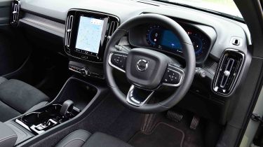
Inside, there’s not a great deal in the way of opulence, and yet the XC40 still manages to deliver a dose of Swedish cool, much in the same way as a well-resolved Ikea living room display. There’s little in the way of clutter, and although the actual amount of space isn’t any greater than the class average, a variety of neat, practical touches make the XC40 feel a lot more ‘real-world liveable’ than many of its rivals.
Used - available now
The XC40 gets the same nine-inch portrait-layout infotainment display as the XC60 and XC90, as well as a 12.3-inch digital instrument panel instead of conventional dials. The latter looks good and can be made to display a map, which is useful when following instructions from the built-in sat-nav, but it’s nowhere near as configurable as the Audi Virtual Cockpit system, or as easy to use.
What is the interior quality like?
There are plenty of hard plastics in the cabin, but some of them come in handy, such as the plastic panels on the front seat backs, which make them more resistant to kicks. What isn’t finished with conventional plastic has piano black trim, and while it all feels well built and gives a premium ambience, we wonder how the material will look after a few years of use, when it has succumbed to scratches and marks.
Sat-nav, stereo and infotainment
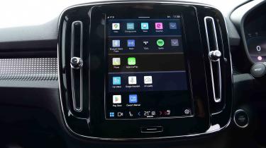
The XC40 features a nine-inch portrait-oriented central touchscreen, which these days is on the small side when compared with some rival set-ups. It runs an Android-based operating system with built-in online Google services, just like Volvo's larger XC60 and XC90 SUV siblings. The graphics are sharp, and the shortcut keys are bolder and less fiddly to use than previous Volvo setups – although they could still be made bigger.
The screen’s loading times are good, but we found that it took quite a long time from typing an address into the system before eventually getting the first navigation instruction. You can use voice activation by saying ‘Okay Google’, but you still have to wait for it to calculate. Google’s live traffic info means the route and time to the destination will be accurate.
There is a physical home button below the touchscreen, while further down, you'll find a large volume dial and a row of buttons, including the hazard warning light and heated rear window (Plus trim adds a button for the heated windscreen). The rest of the climate controls and air-con settings are adjusted through the touchscreen. For a first-time user, the set-up takes a little getting used to.
While there is smartphone connectivity, you’re encouraged to log into your Google account, along with any of the pre-installed apps you might use, such as Spotify. It takes a long time to set up, but once you’re logged in the system is hard to fault. Wireless phone charging is provided as standard, and the 250-watt, eight-speaker system provides decent sound quality. The top-of-the-range Ultra comes with an upgraded 600-watt, 12-speaker Harman Kardon set-up, which is excellent.


