Volvo XC60 review - Interior, design and technology
It doesn’t have the same wow factor as it once did, but the XC60 still looks handsome and features a well built cabin and Google tech

The second-generation XC60 launched back in 2017 and has received a steady stream of updates ever since, including powertrain updates, trim level restructuring and a mid-life facelift. The XC60 is less dramatic-looking than a Range Rover Velar or Lexus NX, but the Volvo is still very handsome. It shares plenty of elements with the larger XC90 as well, including the ‘Thor’s Hammer’ headlights, muscular haunches and Volvo badge that sits proudly in the centre of the large grille.
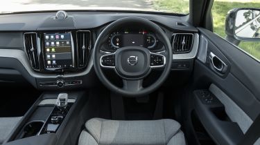
Volvo’s cabin designs don’t have the same initial wow factor as they did a few years ago, but the XC60’s interior still feels like a luxurious, relaxing place to be and it’s hard to fault the build quality. We particularly like the sturdy feel of the door handles and the steering-column stalks, while the driving position has loads of adjustment and the seats themselves are supremely comfortable.
The XC60 we used for our twin test against the updated Range Rover Velar also featured the optional wool-blend seat upholstery. If you don’t fancy a cabin filled with leather hides, it’s a great alternative that feels and looks smart. Plus, when it’s combined with open-pore wood trim on the dashboard and the huge panoramic sunroof, the Volvo feels wonderfully light and airy inside.
Used - available now
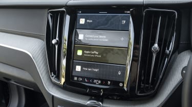
In terms of technology, the XC60 features a large nine-inch portrait-oriented touchscreen in the centre of the dash – which we talk about further down – and there’s a 12-inch digital driver’s display behind the steering wheel. The latter simply isn’t as sharp as its rivals’ setups, and the information isn’t as well presented.
Sat-nav, stereo and infotainment
The XC60 now uses the Android Automotive operating system, which means you get Google apps built-in. The Google-based navigation system is particularly excellent for route-plotting and traffic avoidance, loading times are quicker than systems in newer rivals, and the screen is responsive to touches.
However, at nine inches, the XC60’s touchscreen isn’t quite as grand as the displays in rivals like the Range Rover Velar or Mercedes GLC. Its portrait orientation also comes with its own set of drawbacks. When plotting a route in the navigation system, for example, the on-screen keyboard is very small, so typing an address or a postcode is very fiddly. There’s a similar issue with the temperature controls, which are fairly small unless you open the main climate menu, but that’s another button press that seems unnecessary when a simple shortcut would do the trick.
Android Auto and Apple CarPlay are included as standard if you prefer, plus there are USB-C charging ports dotted around the cabin, with two in the centre console armrest and two for rear passengers as well. Ultimate-spec versions also feature a 15-speaker Bowers & Wilkins stereo that’s spectacularly good; the only way you’ll find better is by buying yourself a Bentley with a Naim setup.

