Dacia Duster – Interior, design & technology
The latest Dacia Duster adds some form to an otherwise functional design

The third-generation Duster has adopted a tough new look, with more thought being put into not only its overall shape, but many of the finer details, too. The squared-off bonnet edges give a distinctive appearance from behind the wheel, but also help the driver to place the front of the car in tight spots. Chunky plastic cladding surrounds the lower portions of the car, too.
The Duster has always been known for its no-nonsense cabin designs that border on the old-fashioned, but this new model has maintained its predecessor’s honest feel while adding some style and one or two useful ergonomic features.
What is the Dacia Duster like inside?
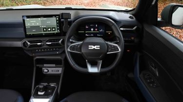
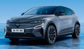
Much more effort has been put into the look of the new car’s cabin. There are still Renault parts here, but they’re well integrated; the bank of physical toggle switches for the climate controls (a feature borrowed from the Renault Clio and Captur) is a great touch, and Renault’s familiar media control stalk behind the steering wheel is still among the most usable designs of its type. Oddly, though, the main volume controls aren’t easy to find; they’re on top of the display.
Driver-assist functions can irritate some drivers, and Dacia has made turning them off easy with a ‘Perso’ setting. This mode lets you choose the features that you want (and don’t want) and store them in a preset mode. This can then be accessed via a button to the right of the steering wheel.
What is the interior quality like?
Subtly coloured and textured finishes do a decent job of distracting from the fact that everything is finished in hard plastics. In a car which pitches itself as a bit rugged, this seems like an appropriate way to save some cash. The centre console doesn’t feel particularly sturdy, though.
Sat-nav, stereo and infotainment
A digital dashboard is quite a novel introduction for the Dacia family. As you’d expect, its layout is fairly simple, but it works well. The graphics look very sharp, and the green colour scheme continues the outdoorsy theme, while large buttons on the steering wheel make it easy to scroll through modes.
Dacia has furnished all versions of the Duster bar Essential trim with a 10.1-inch touchscreen infotainment display. It has a simple yet bright colour palette that is easy to read and looks contemporary. The same can’t be said when you engage reverse, because the cameras are very low-resolution, relaying a pixellated image back to that big screen. That aside, it’s a decent system for the money.
Top-spec versions of the Duster feature the Media Nav Live system that comes with eight years of connected services. The loading times are okay, and programming a navigation route is fairly straightforward thanks to a decent on-screen keyboard size.


