Toyota bZ4X - Interior, design and technology
A stylish exterior design and a high-quality feel to the cabin should help the Toyota bZ4x win over buyers

The bZ4X has a lower roofline and sleeker appearance compared with the more upright style of its RAV4 sibling. But Toyota has engineered it to be more than just a stylised crossover; it’s been co-developed by the 4x4 experts at Subaru, so it offers better off-road credentials than its closest rivals.
A quick glance at the bZ4X’s exterior and you’ll immediately notice its angled lines, smart LED running lights and a sporty rear spoiler with twin winglets that are claimed to improve aerodynamic ability. The tough-looking, black plastic wheel arch cladding hints at the bZ4X’s junior off-road ability in all-wheel-drive form.
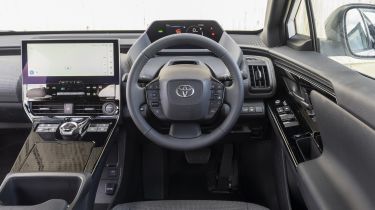
Inside, you’ll be greeted by a cabin that offers decent quality, but not so much sparkle or excitement. The materials used on the most regular touchpoints are good, but the cabin can feel a little dark and sombre, lacking the variety of the Skoda Enyaq iV with only black or light grey synthetic leather upholstery to choose from. Exterior paint colour options are equally conservative, with Dark Blue metallic and Scarlet Flare red pearlescent hues the only highlights in a palette of mostly black, grey and silver shades.
Ergonomically, the bZ4X provides a much more traditional, user-friendly dashboard arrangement than rivals such as the Hyundai Ioniq 5 and Volkswagen ID.4, with more buttons and dials instead of sliding, touch-sensitive controls. The jury’s out, however, on the low-set steering wheel position, which has more than a hint of Peugeot’s i-Cockpit approach, and can feel just as awkward. It’s something that we recommend you try out for yourself before doing the deal, to see how you get on with it.
Sat-nav, stereo and infotainment
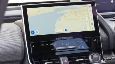
The entry-level bZ4X Pure features an eight-inch touchscreen, while Motion and Vision-spec models feature a 12.3-inch central display. We’ve tested the larger screen, which sits high on the dash and is integrated into the centre console.
The screen is much more responsive and looks better than the systems in past Toyota models. It’s great to see progress in this area, but there’s still a little more lag when using the menus than in the Ioniq 5. The icons are big, though, so it’s relatively easy to see what you’re doing, and the smartphone connectivity is well-integrated. There are screens to assess your driving and electric power use, plus there are separate air-con controls that are easy to operate.
There’s a secure spot for your phone when it’s charging using the wireless pad, or when it’s plugged into the USB port for access to Android Auto or Apple CarPlay.
