GWM Ora 03 - Interior, design & technology
The GWM Ora 03 looks classy inside, but material quality and an awkward infotainment system let it down

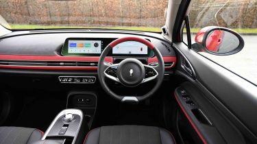
The Ora 03 comes in four colours, none of which is dull silver. Nebula green and Starry black are both single colours with a black interior theme, whereas Aurora green and Mars red are two-tone, with similar bi-colour interiors: green and beige for the former and red and beige for the latter.
GT trim models have sportier exterior details and a model-specific set of diamond-cut alloy wheels. Inside, there are plenty of red trim highlights, but the most valuable extra is the large panoramic glass roof that floods the interior with light.
What is the Ora 03 like inside?
To go with the retro two-tone colour scheme inside the Ora 03, you get some chrome-effect toggle switches, which look similar to what you’ll find on a MINI Cooper, but feel a little flimsy. It isn’t all retro because there are plenty of screens, from the 10.25-inch digital instrument cluster to the 12.5-inch central touchscreen – we’ll discuss how the latter works later. The former can show you quite a lot of information, but it isn’t intuitive to use and can be hard to read at a glance with its light background and small font.
What is the interior quality like?
Besides the soft-touch materials on the top of the dashboard, the rest of the 03 interior is made of hard plastics. They’re not all that impressive to the touch, and neither is the flimsy-feeling centre console. Then there are the touch-sensitive “lit-when-on” steering controls that are very similar to what you’ll find on a Volkswagen ID.3 and aren’t as easy to use as the physical buttons and toggles you’ll find on the wheel of an MG4.
Used - available now

2021 Ford
Fiesta
9,955 milesAutomaticPetrol1.0L
Cash £16,699
2023 Ford
Puma
18,363 milesAutomaticPetrol1.0L
Cash £16,899
2020 Ford
Kuga
24,644 milesAutomaticDiesel2.0L
Cash £25,799
2022 Ford
Kuga
29,177 milesManualDiesel1.5L
Cash £15,999Also, the two-tone colour scheme of some versions of 03 will show marks and quickly look grubby if you don’t clean the interior regularly. Then there’s the rotary gear selector, which rotates freely like the volume switch on a cheap hi-fi; you need to rely on the illuminated indicator to be sure of the gear you’re in.
Sat-nav, stereo and infotainment
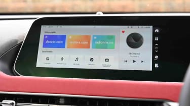
The infotainment system comes with a DAB radio and sat-nav as standard. The latter works quite well, while the six-speaker audio system sounds fine – although, being an electric car, it doesn’t have to contend with the extra noise of an engine. Full smartphone connectivity in the form of wired Apple CarPlay and Android Auto, but we didn’t find it to be all that impressive when we tried an early Beta version of it because it frequently disconnected from our Android test phone. Wireless phone charging is provided as standard.
The infotainment screen has been refreshed, although it uses the same menu layout. For the most part, it responds swiftly enough to inputs, but it still uses small fonts and icons that are hard to read at a glance. That’s not great if you need to check the sat-nav while driving, or change the climate control temperature. Speaking of the air-con system, it could be easier to find in the infotainment screen. The driver’s instrument cluster, like the central infotainment screen, can be awkward to read due to the small font it uses.
There are some odd features in the 03, such as the child mode setting on the infotainment screen. It seems a little creepy when it starts rolling up the windows, increasing the fan speed of the air-con system and playing the sound of a wind-up music box on the stereo. However, it's all done to keep children cool, their attention occupied, and out of the sun if you have to leave them in the car.
