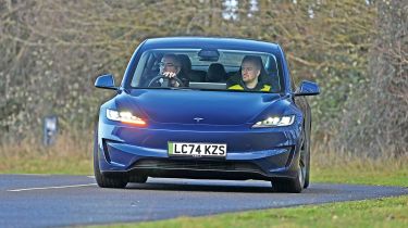
Tesla infotainment review: Tesla UI touchscreen tech tested vs rivals
Tesla is a technology giant, but can the Model 3 beat back the competition?

| Pros | Cons |
|
|
Tesla arguably invented the touchscreen infotainment system as we know it now. Its first cars, such as the Model S and Model X, had massive displays and new-age interface design, but it was the Model 3 and its floating 15.4-inch panel that brought this type of interface to the masses.
So despite being more than five years old, Tesla’s system is still right at the top of the class in terms of ease of use, responsiveness and functionality. Model 3s are without any form of separate driver’s display, so the home screen uses a 60:40 split in its normal setting, with the right-hand side close to the driver having a consistent display of the car and its surroundings, with your speed and the speed limit placed above and a small variable window below. This shows current media, trip and tyre pressures.
A clever shortcut to the specific lighting or wiper controls pops up temporarily when you click the steering wheel-mounted buttons, giving quick access to deeper functionality, such as wiper speed. This can be controlled on the screen or by the left-hand scroll wheel on the steering wheel.
The left-hand side of the screen is where the navigation lives, and it’s intuitive, quick to react and has good routing capabilities. Adding second or third stops to your journey is also a breeze.
There is a static section at the base of the display that shows your interior temperature, plus an arrangement of favourite ‘apps’. Cleverly, if there’s someone sitting in the passenger seat, a second temperature control will appear, and if you click either of the temperatures on the base, a full climate control pop-up will temporarily show on the main screen.
The main app menu is also accessed through this section, which will open floating windows on top of the mapping. If your nav is active, next-turn prompts will pop up on the driver’s section, but the main nav screen can be easily reached with a quick swipe down. It takes almost no time to get to grips with.
The high-resolution screen is very fast to respond, bright and easily on par with a modern smartphone in terms of responsiveness. Tech has always been a core part of the Tesla experience, and so it continues to be.
| Touchscreen task | Time | Ranking |
| Lane-keeping assistance task | 11.7 secs | 6th |
| Sat-nav task | 13.7 secs | 4th |
| Cabin temp. task | 4.4 secs | 6th |
| Heated seat task | 6.6 secs | 10th |
| Radio tuning task | 5.4 secs | 4th |
| Distracted lap time | +32 secs | 7th |
Test team views
- Dean says: “The climate controls were easy to set. The lane departure wasn’t quite as simple, because it’s in a secondary menu. There are a lot of menus here that you’ve got to break down and go through. The touchscreen is good, but other cars have the option to not use the touchscreen at all, which I think is always preferable. Here, you’re just stuck with it.”
- Shane says: “It’s a Tesla, so it’s a technology piece first and a car second, at least in my eyes. It’s pretty straightforward to understand, and even if there’s plenty to do in there, it’s logical and quick. The sat-nav took a bit of time to load, but that could perhaps be down to the car’s location and weak connectivity. I’ve no major complaints really; everything is very logically laid out.”
- Victoria says: “It’s very nice. The only thing that I would change is indicating, because the controls are actually on the steering wheel instead of a column-mounted stalk, which takes a while to get used to. The screen is very intuitive and it’s easy to find everything that you’re looking for, because the menus are well separated and laid out.”
Display and navigation
- Destination: Huge screen offers a big keyboard and useful shortcuts to recent destinations or Superchargers that are nearby. Mapping is clear and simple to read.
- Settings: There are numerous widgets to select from, which appear in a smaller frame so you can select the functions behind it. The shortcuts below are on the small side.
- Controls: Tesla has even eliminated the traditional indicator stalk, so the roller switches on the steering wheel are used for multiple functions.
What's the app like?
Tesla’s cars are all about the tech, so it’s no surprise that the brand’s companion app is one of our favourites to use. Features such as live exterior feeds via the Sentry Mode cameras, route planning via the Supercharger network and the ability to ‘summon’ the car from a parking space make the app truly stand out.
But it’s the small detail we appreciate most. For example, rather than just enabling you to turn on the climate controls and pre-heat the cabin, the app lets you specify a temperature – something that we’re surprised other brands don’t offer. We ranked it first out of the ten apps we tested.
Best car infotainment systems: head-to-head test
- Best car infotainment systems test intro
- Ford SYNC 4 review
- Genesis ccIC review
- Mercedes MBUX review
- MG iSmart review
- MINI Operating System 9 review
- Peugeot i-Cockpit review
- Renault OpenR Link review
- Skoda Navigation review
- Tesla UI review
- Volvo Android Automotive review
- Best car infotainment systems test results
Our dealer network has 1,000s of great value new cars in stock and available now right across the UK. Find your new car…
Find a car with the experts