Mercedes infotainment review: MBUX touchscreen tech tested vs rivals
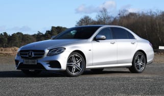
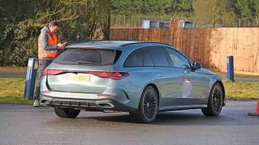
Is the Mercedes E-Class's tech as fancy as its badge?

| Pros | Cons |
|
|
Not many car makers have their very own infotainment system – and we’re not just talking about a few logos on top of a commonly-used layout either – but MBUX is truly bespoke to Mercedes and certainly helps to give the brand’s cabins a special environment.
MBUX first arrived in 2018 on the Mercedes A-Class, but over the years it has evolved with more functionality to suit a variety of screen sizes. There’s the ‘Hyperscreen’ layout that is currently used on the S-Class and EQS, which comprises three panels with a total of 55.5-inches of display area. Then there’s a twin 10.25-inch screen set-up in smaller models such as the A-Class – where it’s deployed brilliantly – while in C-Class-sized models, there’s an 11.9-inch portrait-orientated panel.
As for the E-Class, the current generation introduced a new ‘Superscreen’, which features a 12.3-inch driver’s display, a 14.4-inch central touchscreen and an additional 12.3-inch panel for the passenger. However, our ‘Urban Edition’ car didn’t come with the passenger-side screen.
Some people might find the touchscreen position to be a little too angled, depending on their driving position, but that seems to be a common trait of Mercedes models that have the smaller and larger screens, too. As for reach, there’s a centre console tunnel that runs all the way to the dash-mounted display, which means you’ll have to keep your arm aloft to access most of the touchscreen, which is a pain.
The infotainment is quite intricate and first-time users might be a bit overwhelmed with the sheer amount of information presented. But once you’re familiar with the set-up, it’s quite easy to navigate through the menus on the move, thanks to a crystal-clear resolution, quick response times and clean graphics and text. Having the climate controls available at the bottom of the screen is sensible, too.
Mercedes added a ‘zero layer’ to its MBUX system in 2022, with the thinking that all the major functions would be accessible on the home screen. It’s a good idea in principle, although we found that certain menu buttons were too small and fiddly.
| Touchscreen task | Time | Ranking |
| Lane-keeping assistance task | 7.0 secs | 2nd |
| Sat-nav task | 16.5 secs | 7th |
| Cabin temp. task | 6.8 secs | =9th |
| Heated seat task | 2.0 secs | 4th |
| Radio tuning task | 3.2 secs | 1st |
| Distracted lap time | Over 30 secs | 6th |
Test team views
- Dean says: “The big screen and shortcut buttons are a massive help. It’s a bit fiddly to do the climate and try to adjust the temperature, because you have to go into the menu to do it. But it’s quite responsive. There are steering wheel controls, but they’re very sensitive, and not the best to use. Yet the touchscreen makes them largely redundant.”
- Shane says: “This system is nice and clear, but setting a sat-nav destination could have been a bit quicker. Tuning the radio was easy, and the heated seats are on a door button – I couldn’t find them via a menu. It was also simple enough to deactivate the lane-keep assist, even though it required you to look at a sub-menu. I did find myself concentrating on the screen a bit more than was ideal, though.”
- Victoria says: “Everything is very straightforward and it’s easy to use the settings. I’d say things feel a bit like Apple smartphone menus, and the system is very similar to Apple CarPlay, so quite familiar. It’s pretty easy to find the things that you need and it’s responsive. Everything worked as it should, and it was very fast.”
Display and navigation
- Destination: A big keyboard helps with address entry, while the field at the top automatically fills with location names, although there are a lot, courtesy of the European database.
- Settings: There are loads of sub-menus, but they are divided according to function – climate settings in the climate controls, nav settings with the map software, etc.
- Home: Large home and back buttons at the bottom of the display help with finding your way, while the various apps are useful for quick access.
What's the app like?
Mercedes’ MBUX system is one of the best in the business, and its companion app is also a strong performer, proving seamless and intuitive to use. We like the customisable shortcut buttons, plus the ability to geofence areas where the car can or can’t be used – ideal if you’re brave enough to hand the keys over to, say, a teenager.
Holding the app back from greatness is its size (roughly 1GB on Apple’s iOS) and how Mercedes uses it to push its rather pricey Digital Services store, which forces buyers to pay a subscription for features included for free on other cars. It finished in 4th place overall.
Best car infotainment systems: head-to-head test
- Best car infotainment systems test intro
- Ford SYNC 4 review
- Genesis ccIC review
- Mercedes MBUX review
- MG iSmart review
- MINI Operating System 9 review
- Peugeot i-Cockpit review
- Renault OpenR Link review
- Skoda Navigation review
- Tesla UI review
- Volvo Android Automotive review
- Best car infotainment systems test results
Buy a car with Auto Express. Our nationwide dealer network has some fantastic cars on offer right now with new, used and leasing deals to choose from...