Polestar 4 - Interior, design & technology
The Polestar 4 is a technologically advanced offering and features a quality interior design

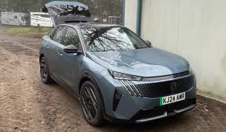
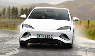
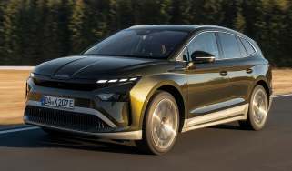
There’s a familiar face to Polestar’s expanding range of cars, all influenced by the Precept concept from 2020. The purposeful front end with its ultra-slim headlights, all-round smooth surfacing, contrasting lower-body panels and a full-width rear light bar are becoming Polestar design traits – along with a higher-riding side profile that helps hide the positioning of the battery within the wheelbase.
Look closer at the Polestar 4 and you’ll notice the technology on full display, with many of the 12 exterior cameras clearly visible. Plus flush-fitting door handles, aerodynamically-optimised wheels and a shallow windscreen rake help make the car as slippery as possible through the air, which in turn allows for its impressive range figures.
At the rear you’ll immediately notice there’s no window. It’s a bold move by Polestar and one that could potentially put off some prospective buyers looking for a more traditional driving experience.
The theory behind this is that the rear window is made irrelevant by the standard-fit digital rear-view mirror. It’s a 8.9-inch display, with a nice, clear resolution, despite the rear camera only having 2.5 megapixels. It pans left and right when indicating – it’s a sudden jump rather than a gradual pan – but customer cars have the option to turn the feature off. That’s fine, because the 121-degree field of view is great anyway. You can also switch it to become a standard mirror if you need to check up on rear-seat occupants.
What is the Polestar 4 like inside?
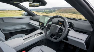
The lack of a rear window may have attracted a lot of debate, but the Polestar 4’s real star attraction is the interior. The dashboard looks and feels as if it’s been designed by Nike, as it ditches the traditional cowhide and piano black plastics in favour of brushed metals and more sustainable materials, inspired by the world of fashion.
The front seats are comfortable, supportive and offer lots of adjustment to find the ideal driving position. And it might sound a little cheesy, but something that works well is the ambient lighting, which has themes based on our solar system, with specific colours for the sun, moons and planets.
What is the interior quality like?
The materials feel upmarket throughout the front of the cabin, and all the key touchpoints, such as the steering column stalks, are weighty and feel solid. The model you see in the pictures has the optional white interior theme and Mist Tailored Knit upholstery, which we think is well worth the extra £900 and gives the interior a very starship-like ambience.
Sat-nav, stereo and infotainment
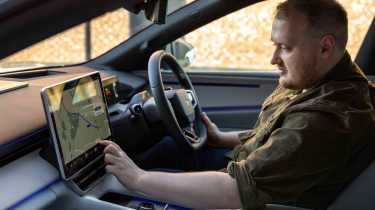
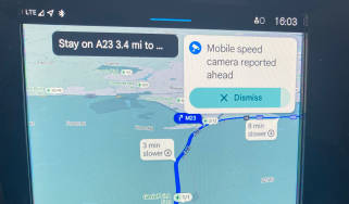
Every Polestar 4 features a super-sharp 10.2-inch driver’s display and a huge 15.4-inch infotainment touchscreen on the dash, rather than the portrait screen in the Polestar 3. The onboard Google-based software prioritises driver customisation, with the ability to select which widgets go on the homepage and adjust a huge amount of settings for the car.
Pages and sat-nav routes load quickly, and everything is laid out very clearly and intuitive to use, like a smartphone (something Google knows a lot about). Our only complaint is just how many functions are buried within various menus and sub-menus, which can make adjusting even some basic settings a distraction if you’re not sure where to look for something.
And with precious few physical buttons, most of the car’s functions are operated on the screen. The steering wheel does come with physical control pads, although the arrows on the side are lit up as they work for a variety of different menus – a strange decision, but one that doesn’t affect the Polestar 4’s usability all that much.
The driver’s display provides all the basic information you require, and is customisable too, so it can show safety systems in action or a full-screen map. We like the head-up display, as it’s not too intrusive and has clear graphics, plus there’s a snow mode to improve visibility in certain conditions.
