Toyota RAV4 - Interior, design and technology
The Toyota RAV4 looks great and is well-built inside and out, but lags behind on infotainment

The exterior design of the Toyota RAV4 has changed beyond all recognition from the ‘90s original, trading in its curves for a much tougher, angular look. There’s a choice of eight colours, with the usual mix of grey, silver and black for those worried about protecting resale values. We think the most interesting colour is actually the free Khaki, which suits the RAV4 quite nicely.
What is the Toyota RAV4 like inside?
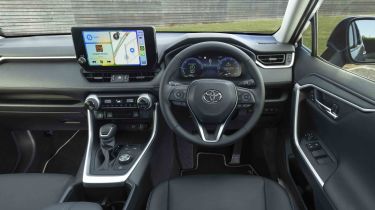
The layout is mostly easy to use, too, albeit with a few extra buttons low down between the steering wheel and the door that can be hard to find without taking your eyes off the road. We like the chunky heating controls, and it’s a nice touch that the rubberised finish makes them easy to grip with cold hands. That will appeal to those who don’t get on with the minimalist design of the all-electric Tesla Model Y, where all the major controls have been relegated to the large central touchscreen – including the controls for the wipers.
All versions come with a 12.3-inch digital dash that can be configured like the Virtual Cockpit you’ll find in the Skoda Kodiaq. It’s a big improvement over the part analogue dial and part digital readout of earlier models, and it’s great that you can customise it to show various driving data and sat-nav instructions. It isn’t as easy to alter the display on the move as the system used in the rivals mentioned above, though.
What is the interior quality like?
The interior quality is hard to fault – the RAV4 feels built to last well beyond the typical three-year PCP cycle without any rattles or squeaks. But, as is often the case with Toyota, the finish is functional more than luxurious. There’s a smattering of double-stitching and soft-touch materials in the places that matter, at least.
Sat-nav, stereo and infotainment
As part of an update for 2023, the RAV4 comes standard with a 10.5-inch central touchscreen, wireless Apple CarPlay, Android Auto and updated virtual assistant. The latest set-up is more responsive, offers better resolution, and the menus are much simpler to navigate, so it’s a definite improvement over the old system. However, we prefer the easier-to-use screen fitted to the Hyundai Tucson, because it's less distracting to use on the move.
All trim levels have a six-speaker audio system, a DAB radio, and sat-nav.


